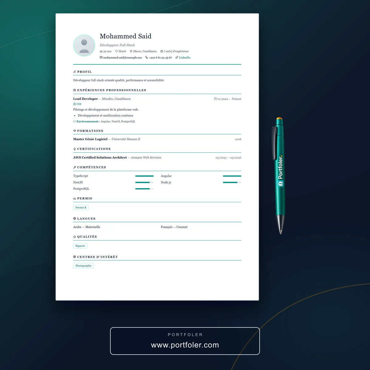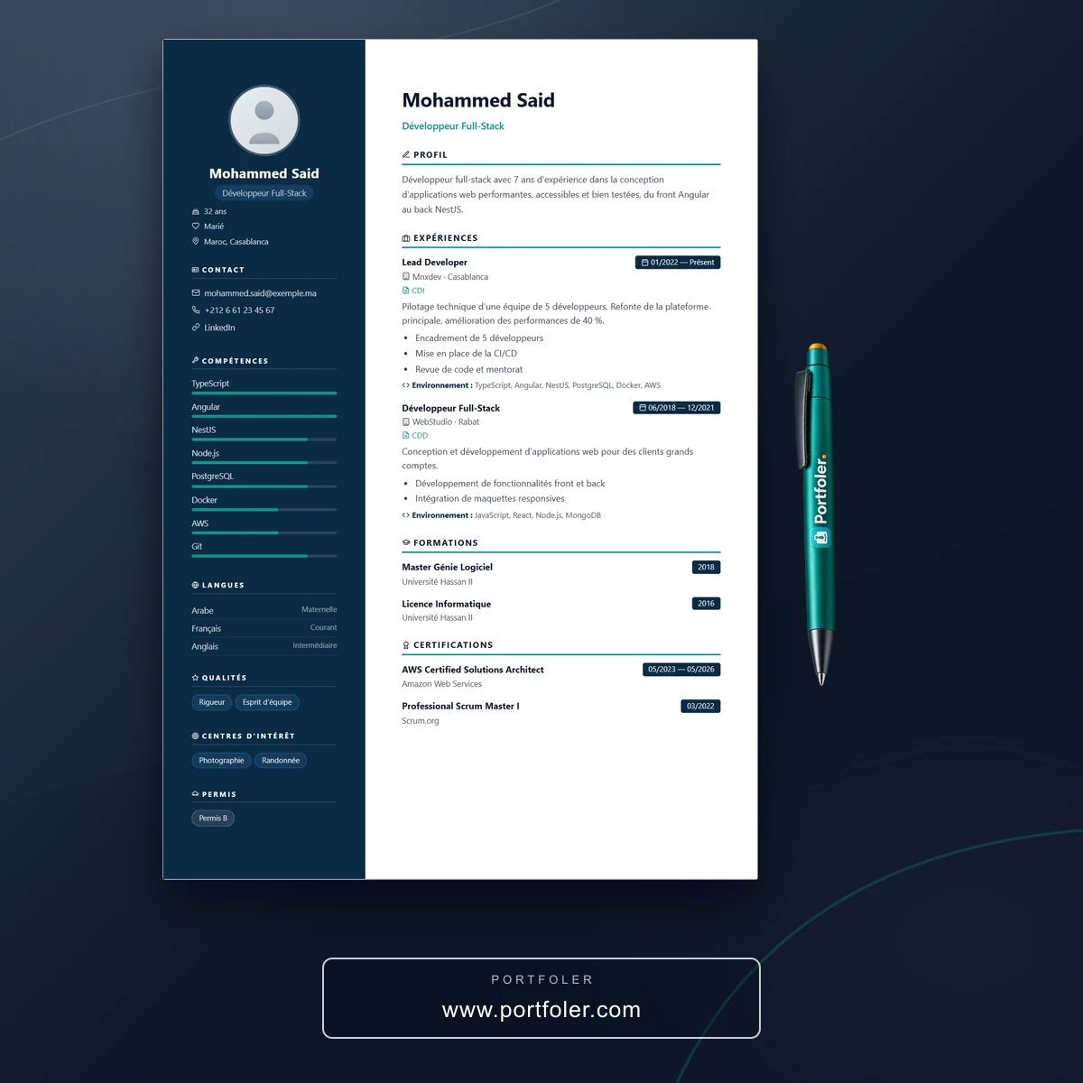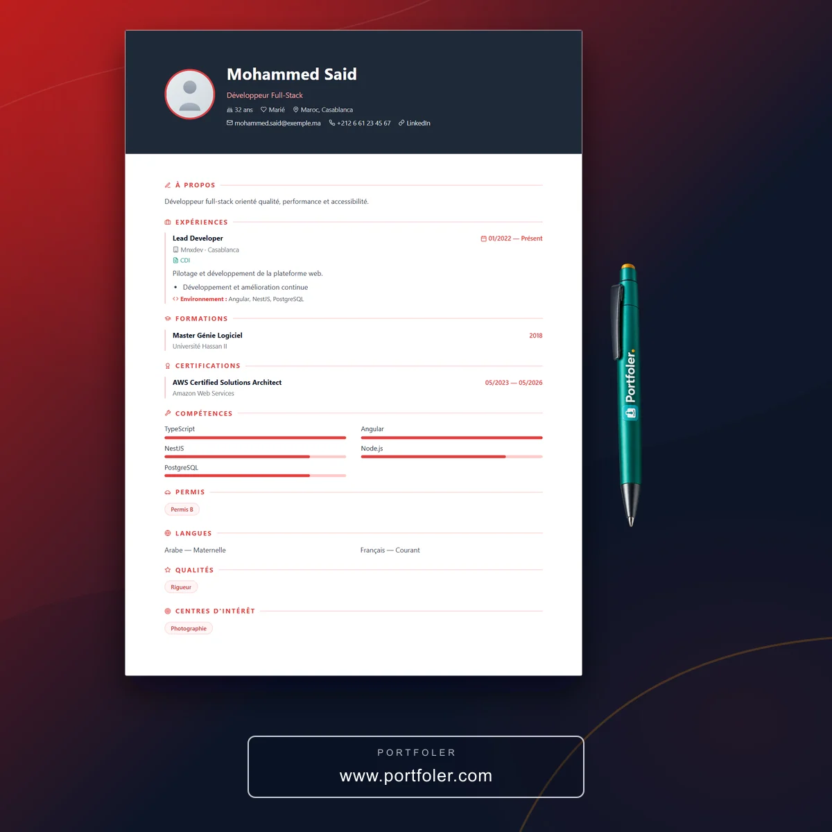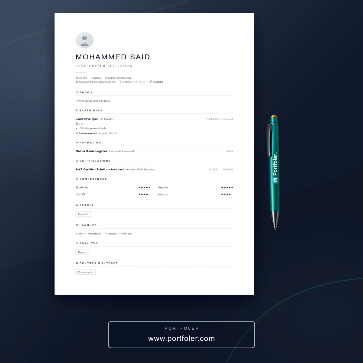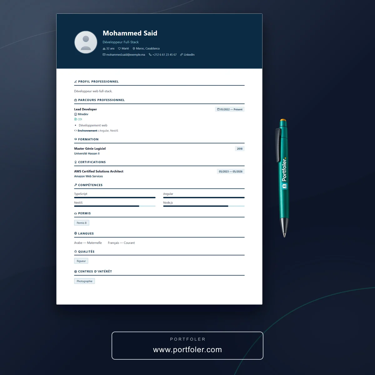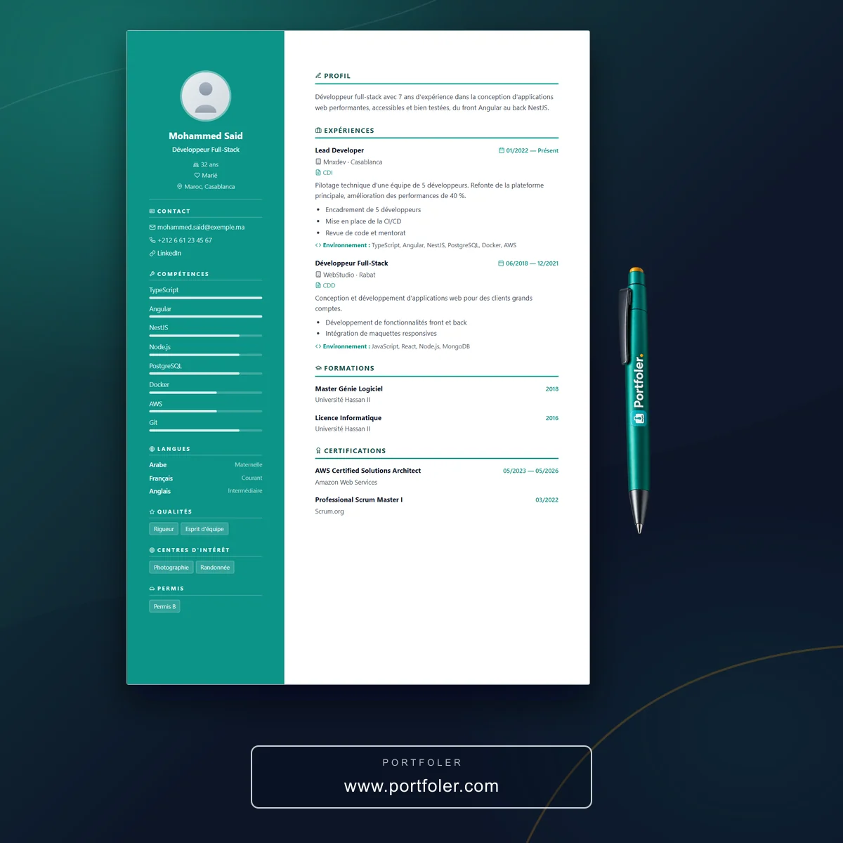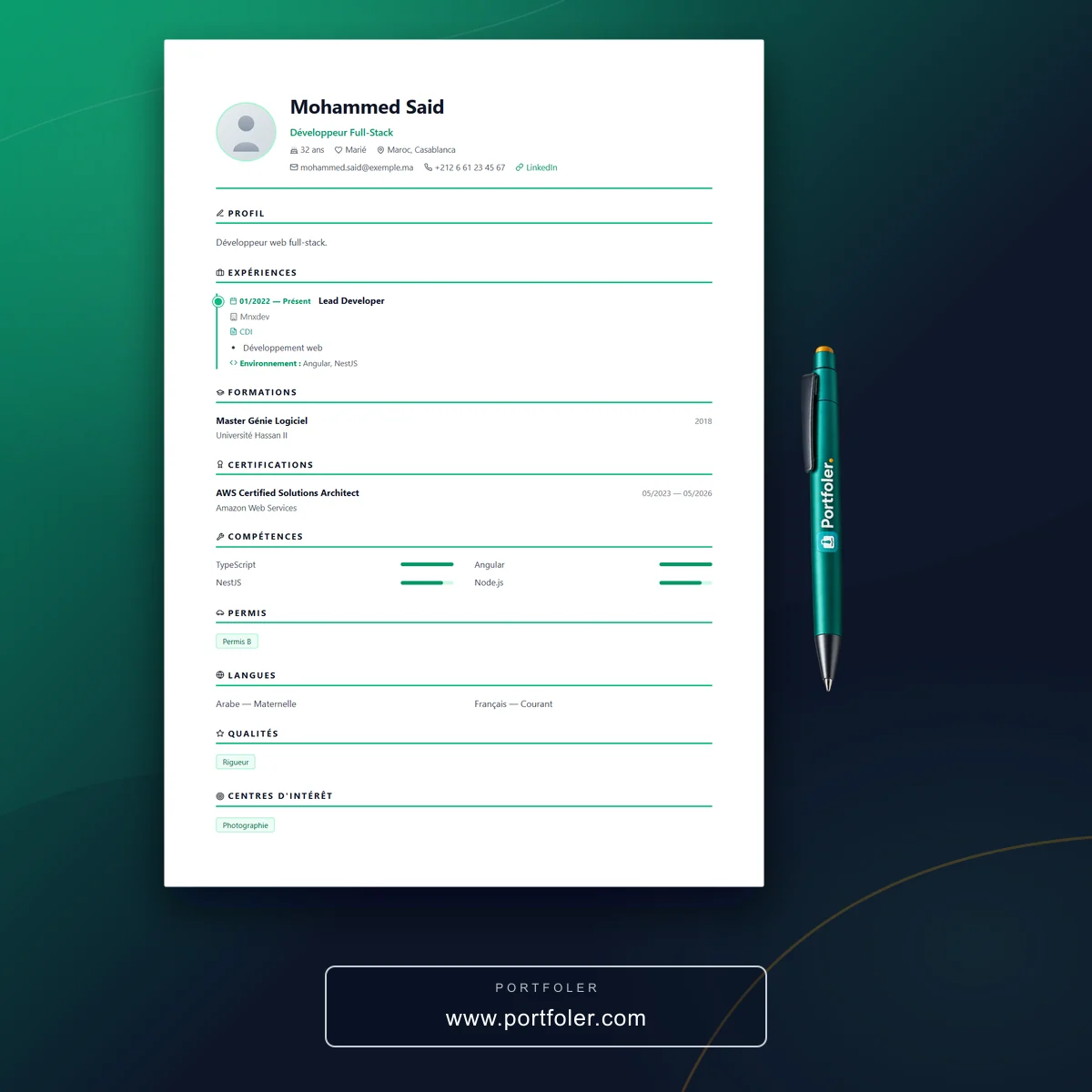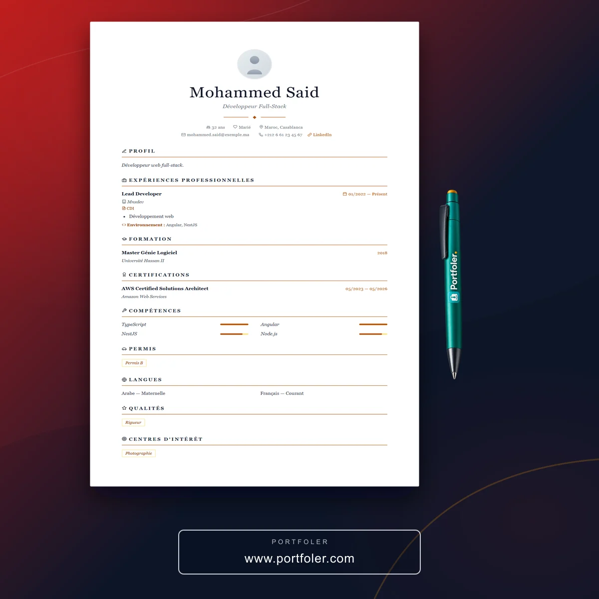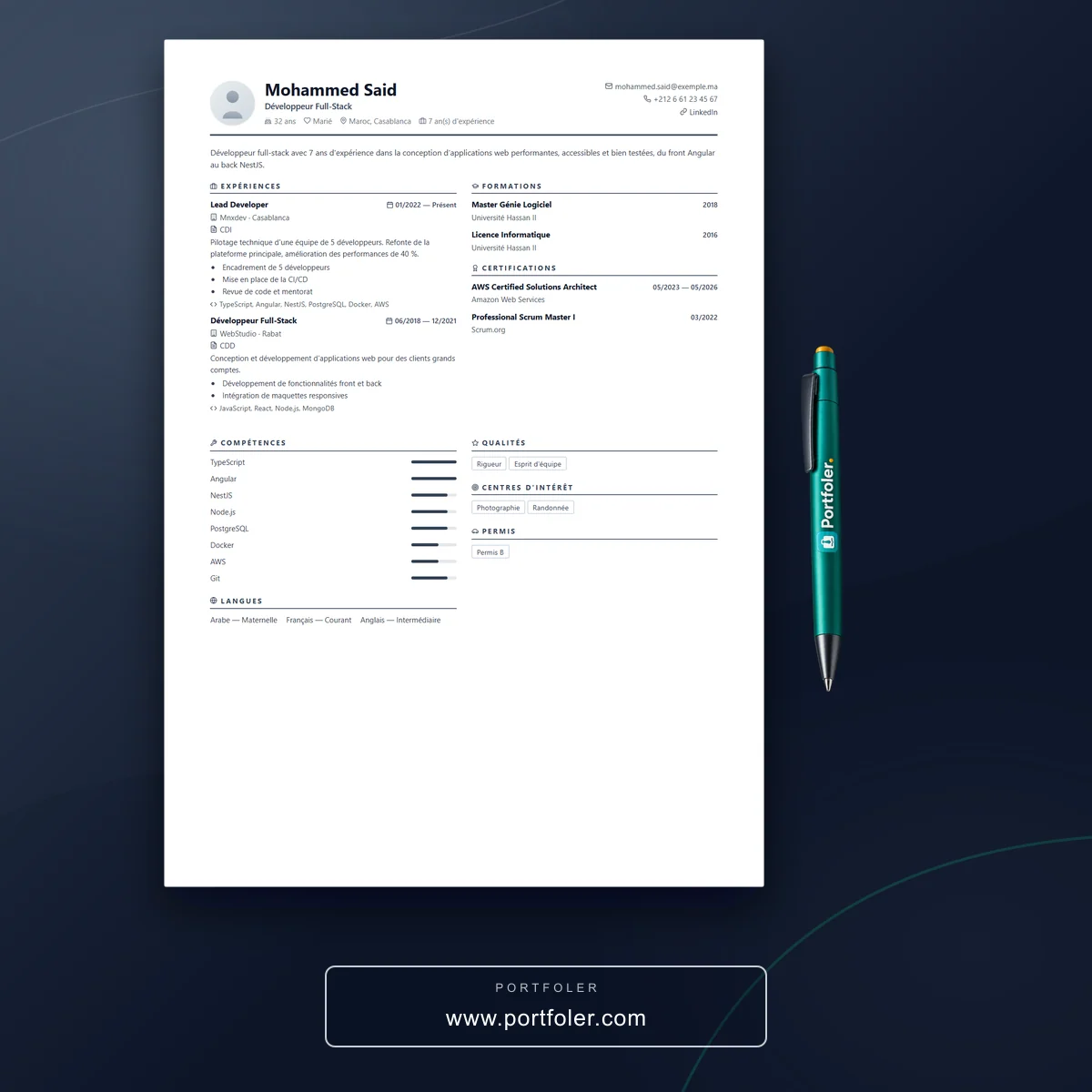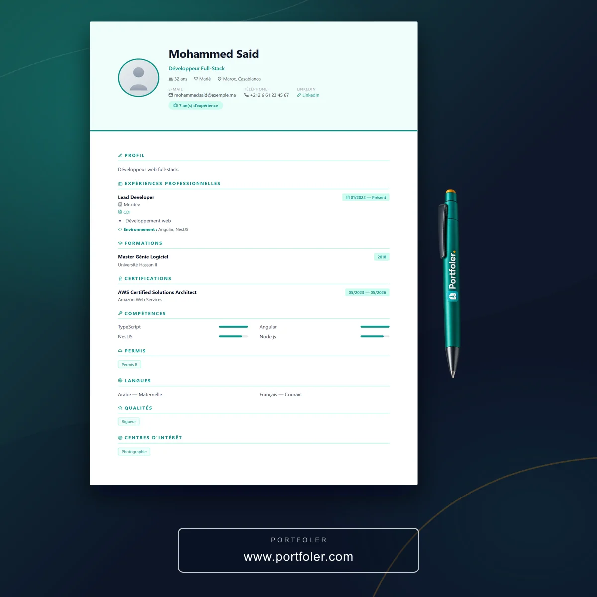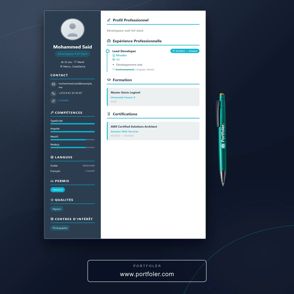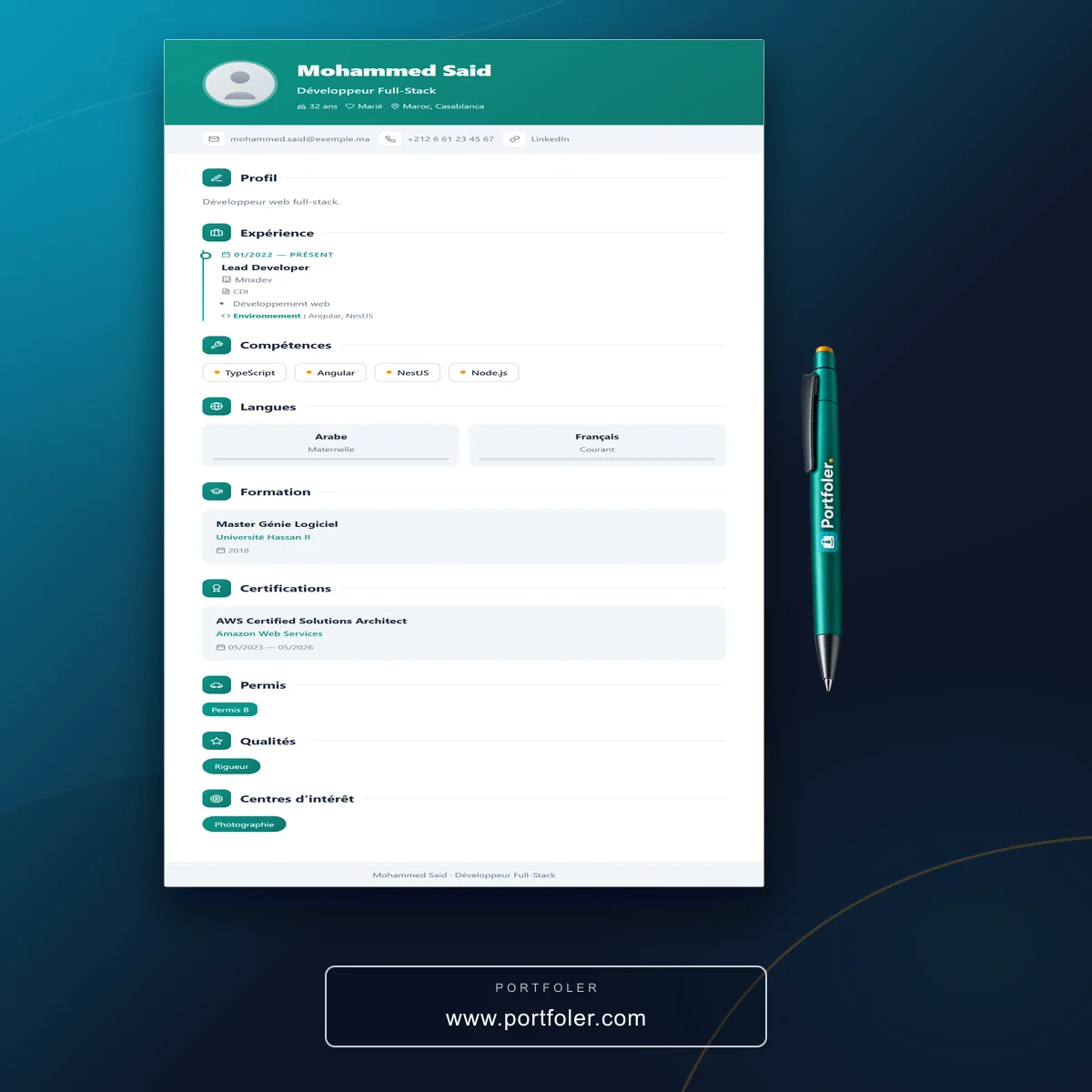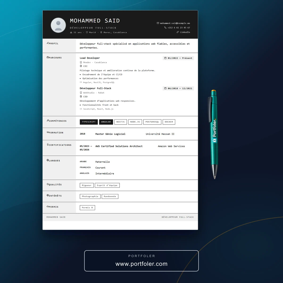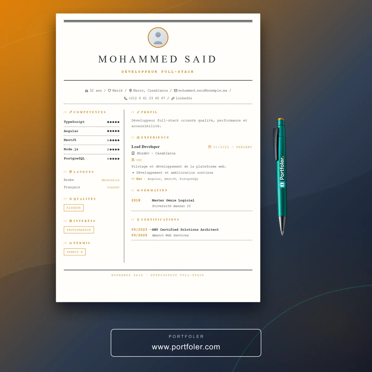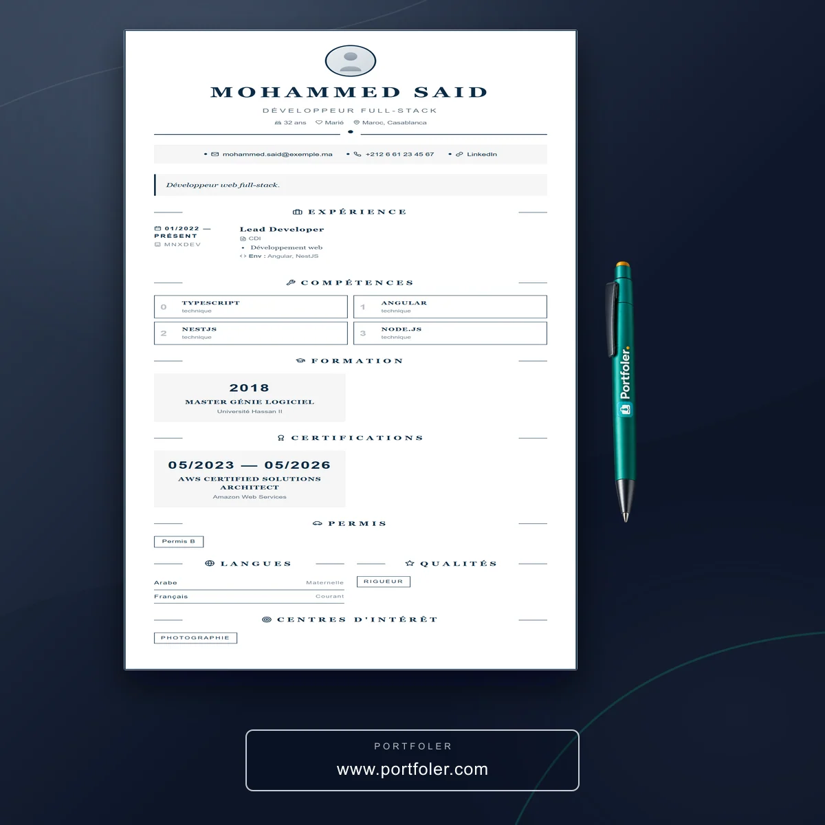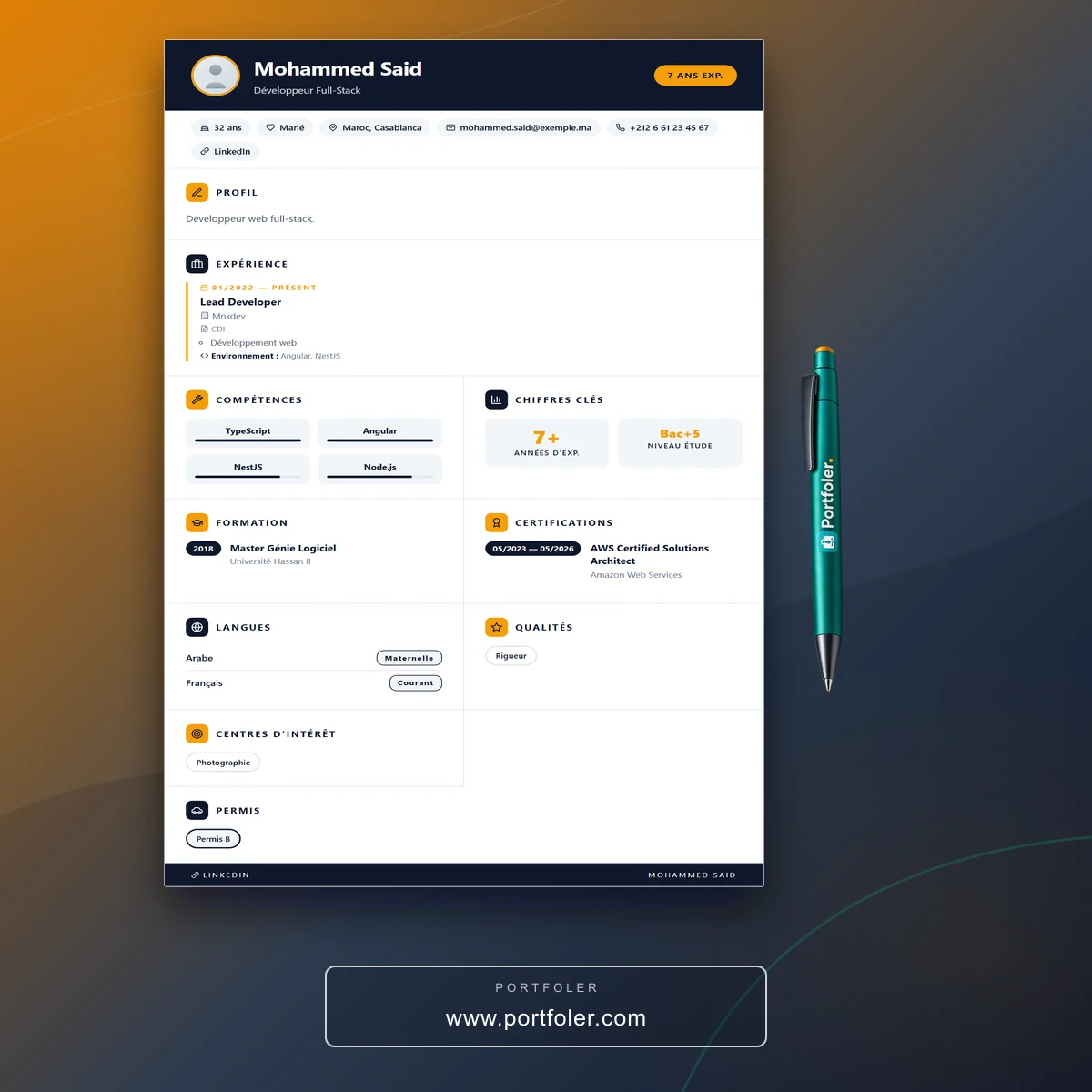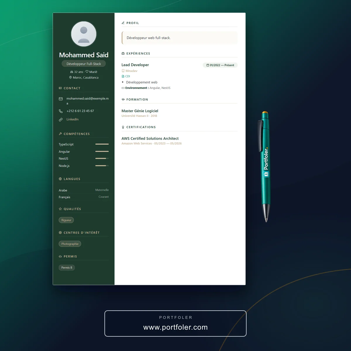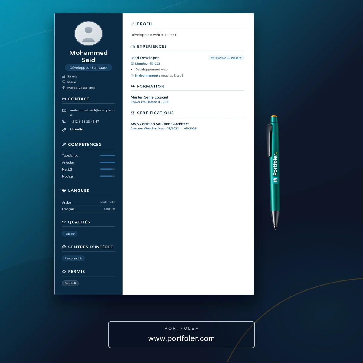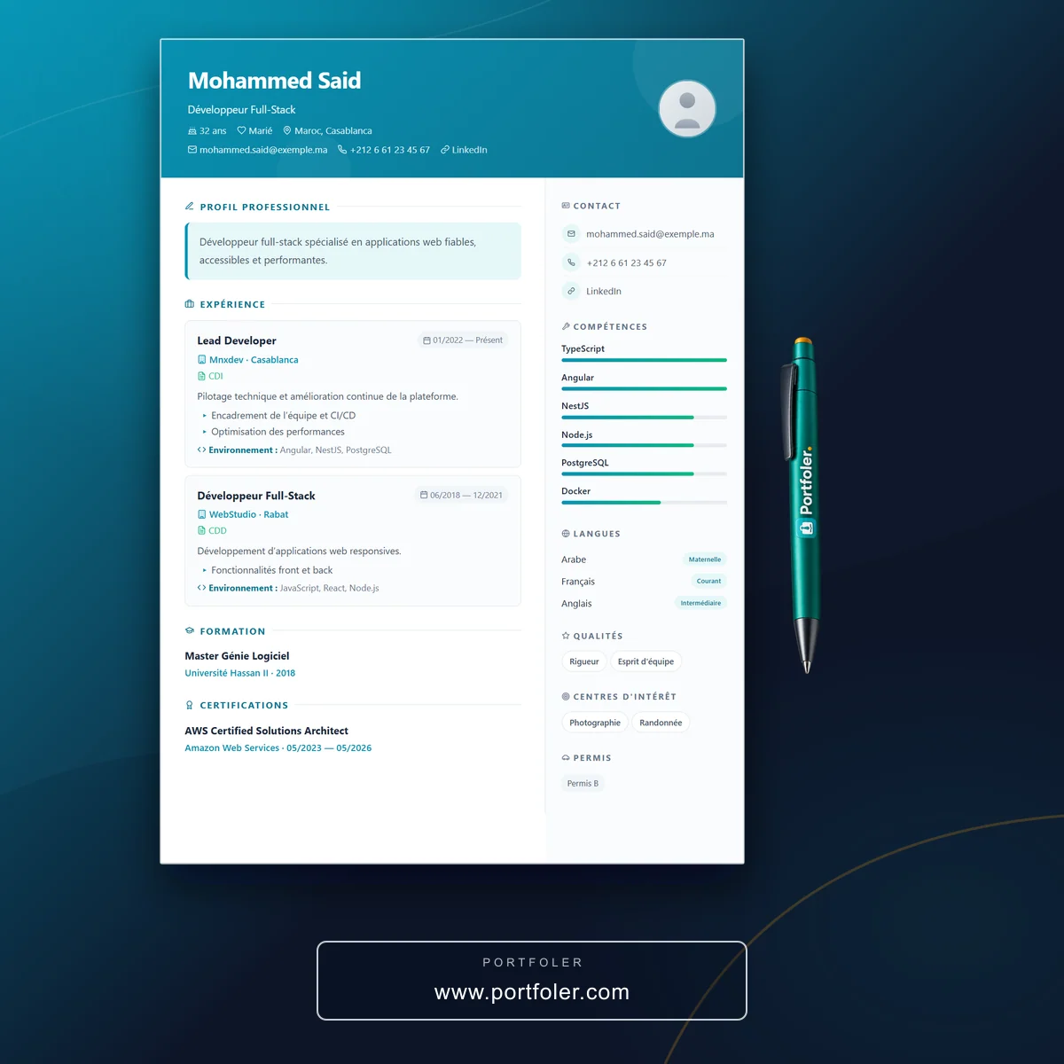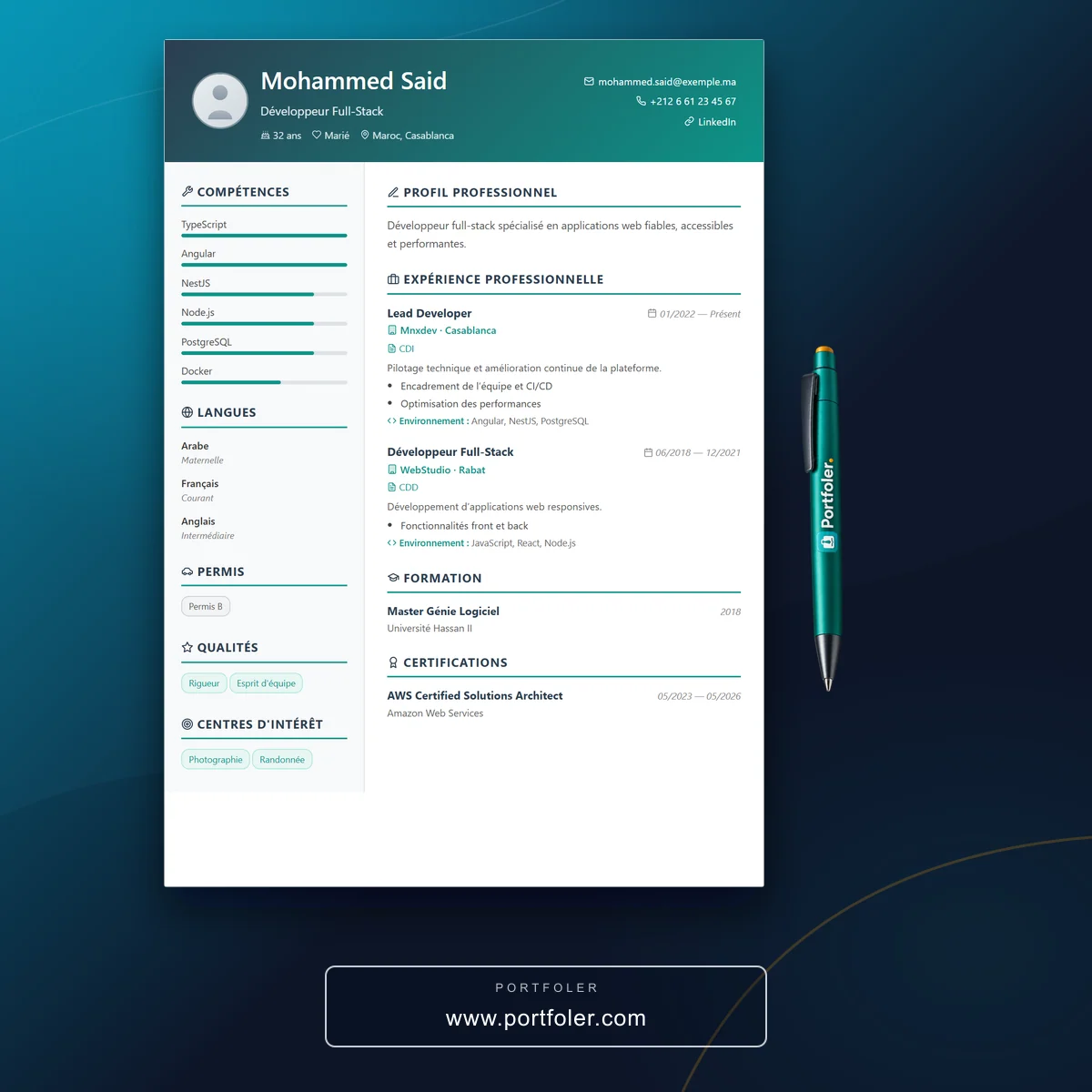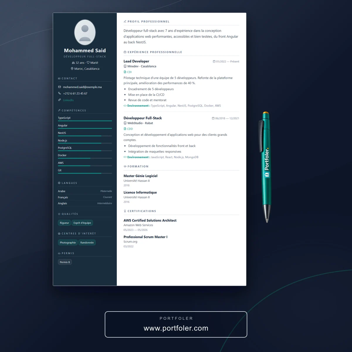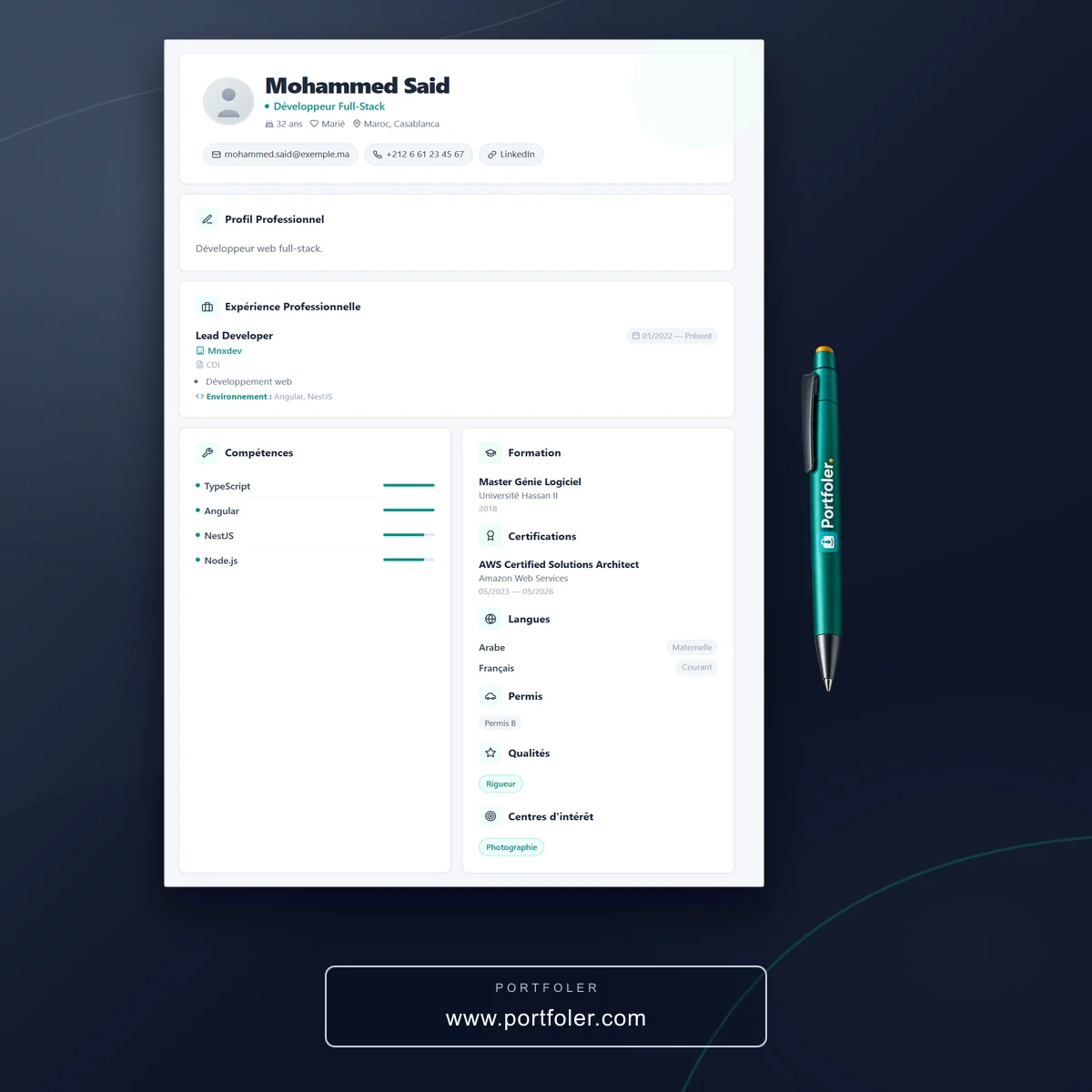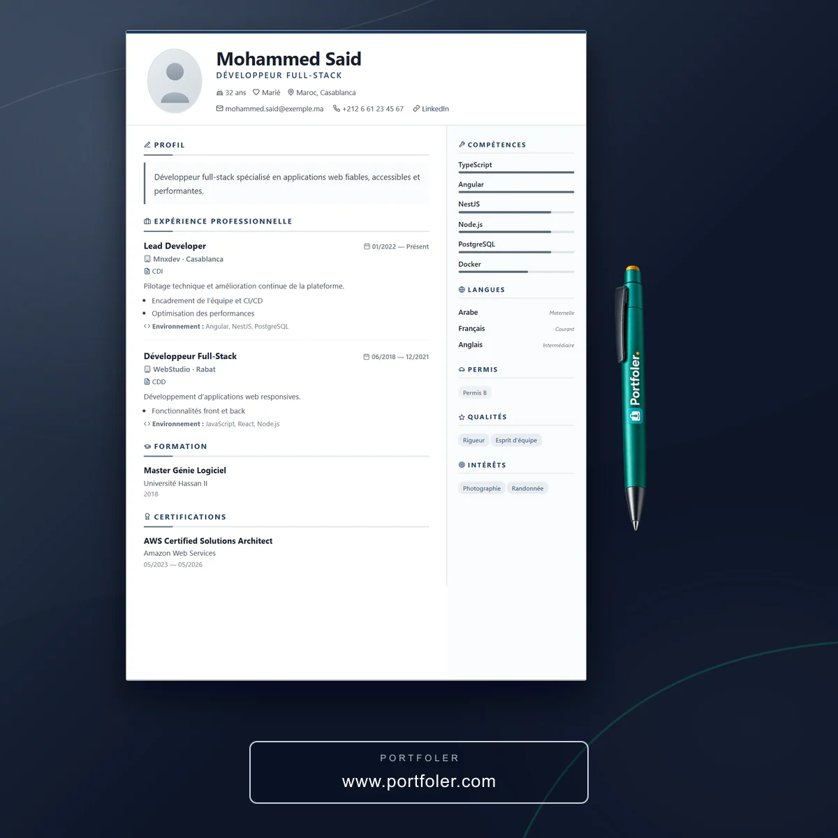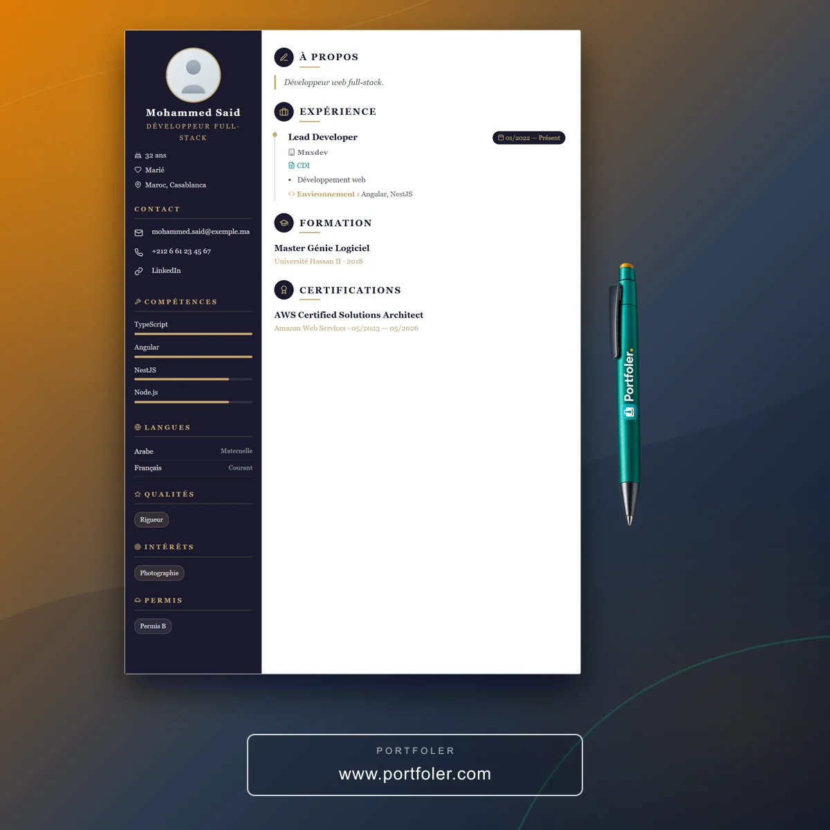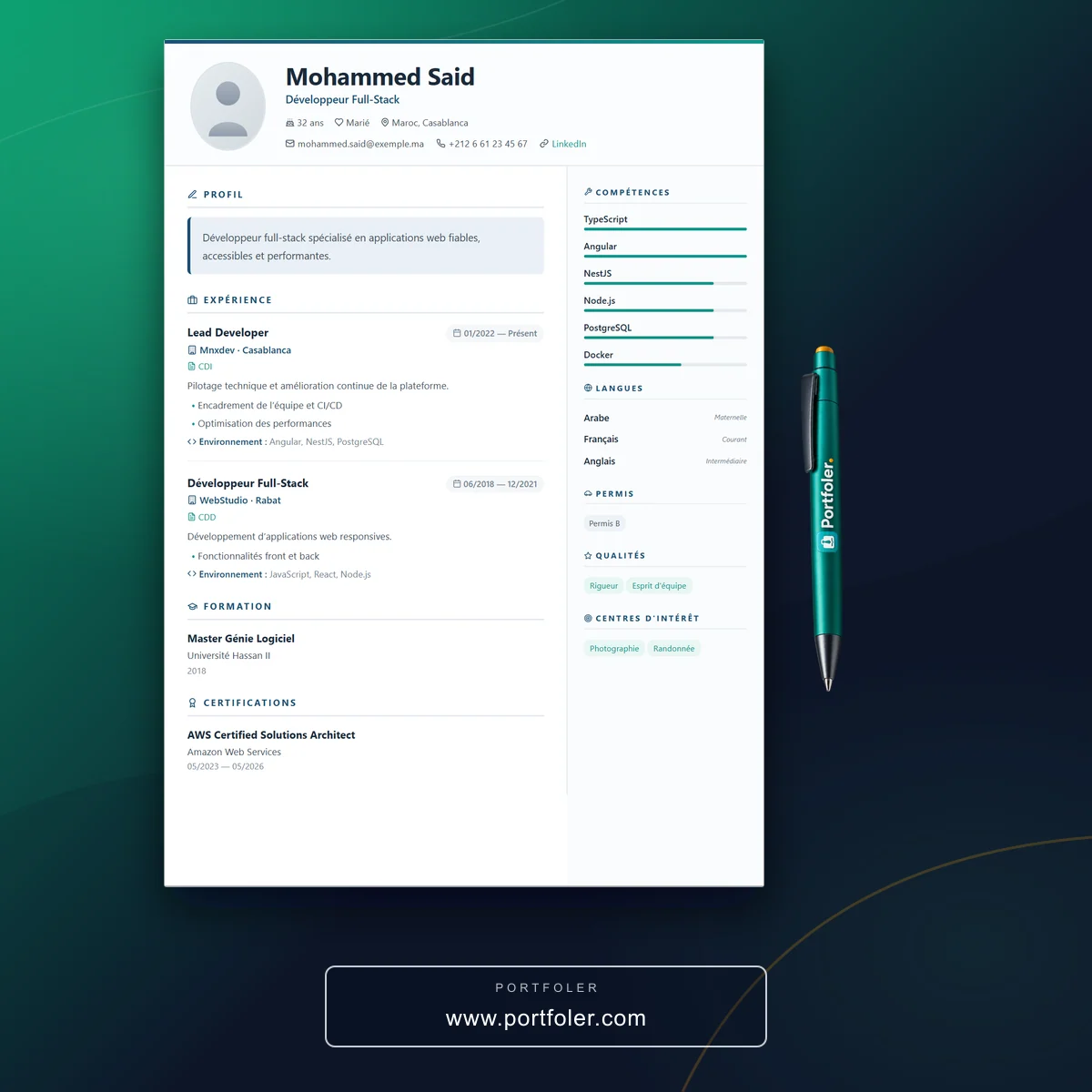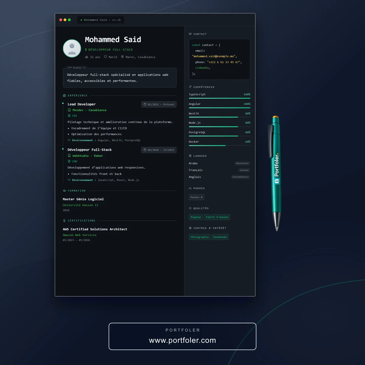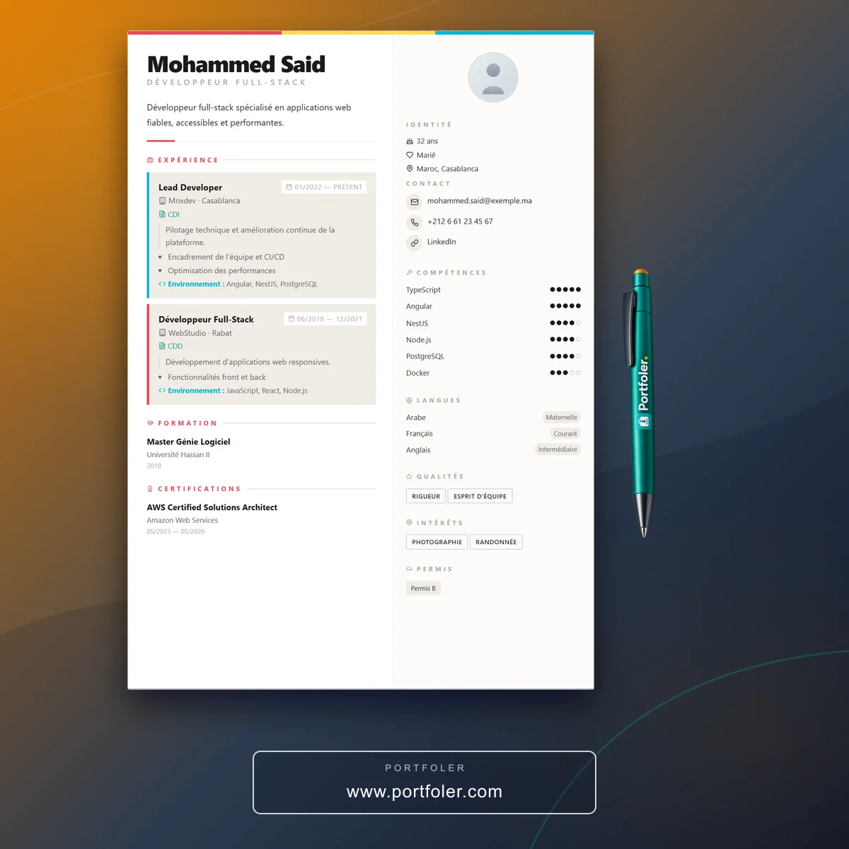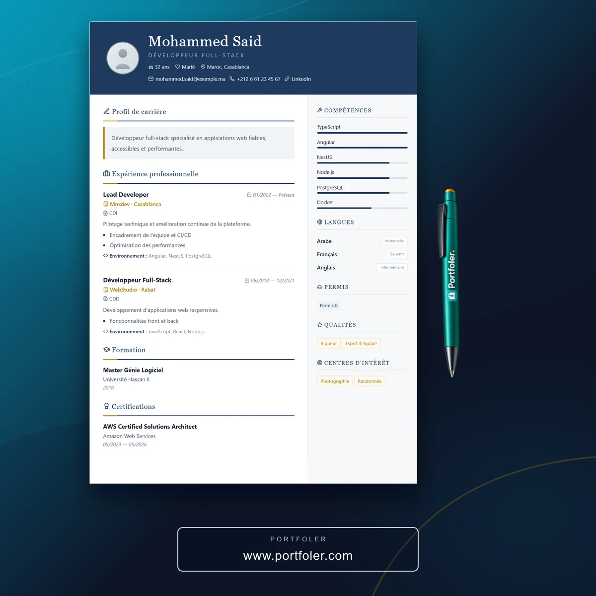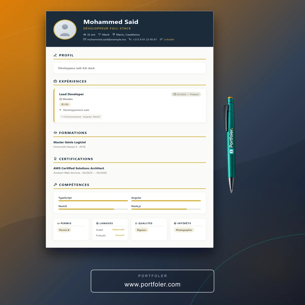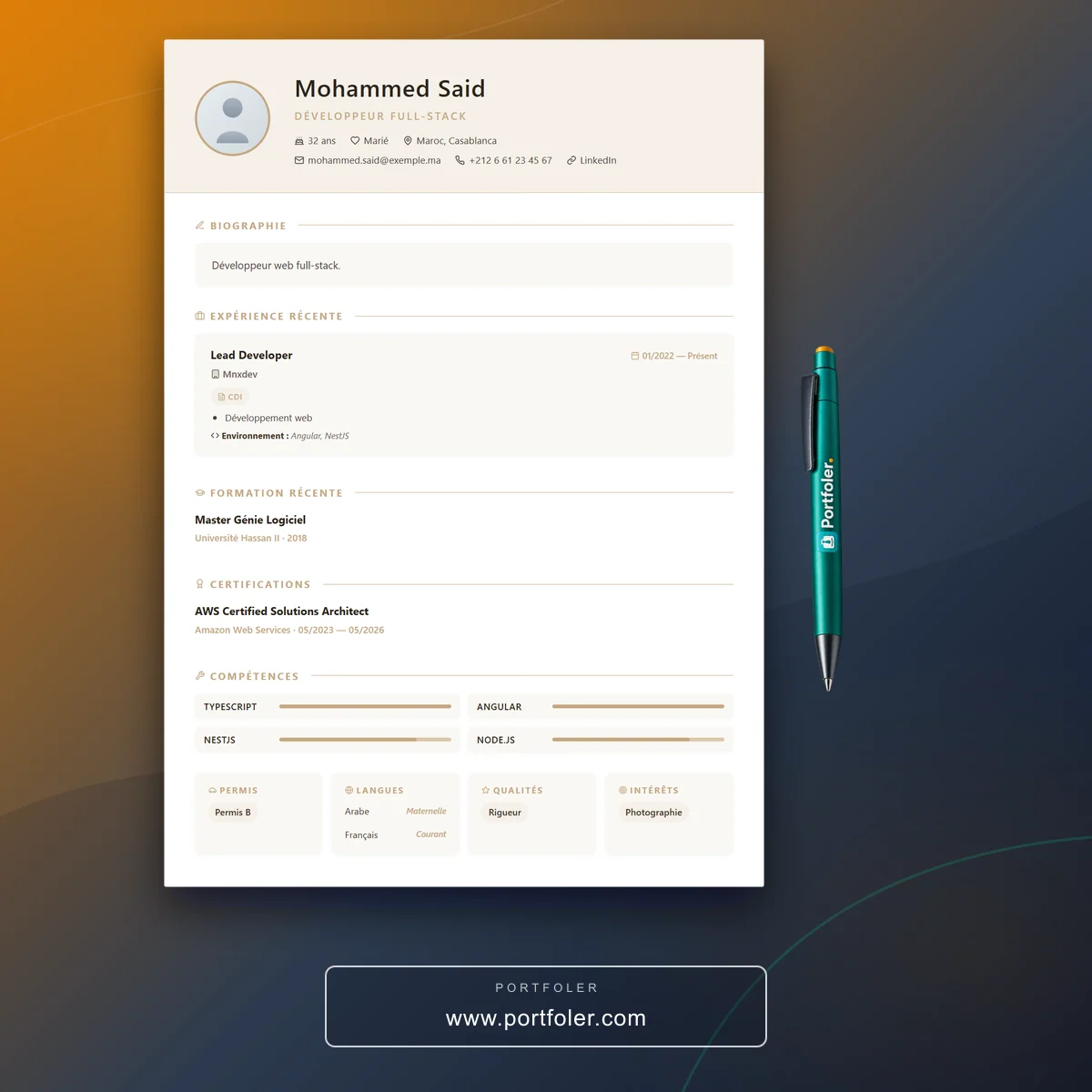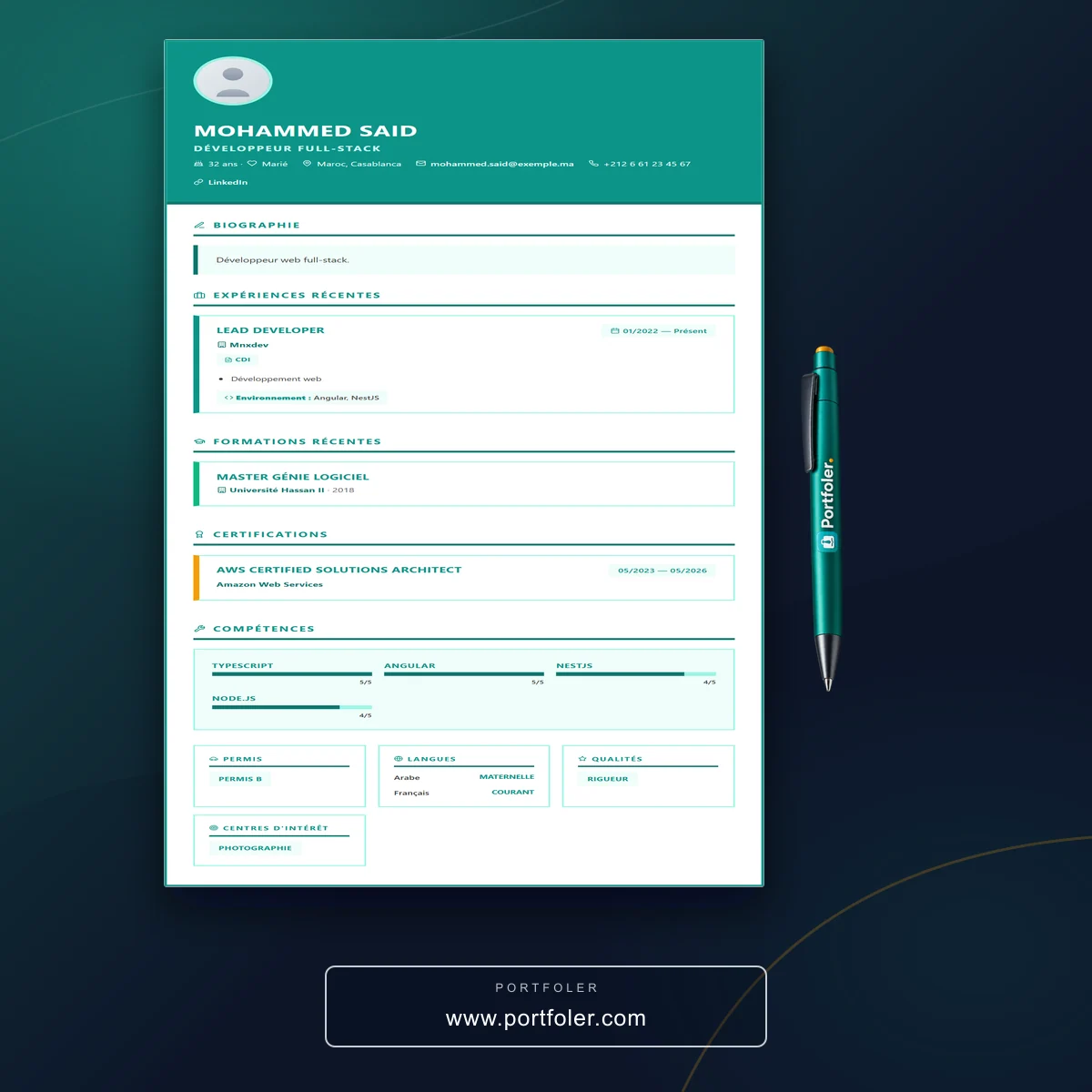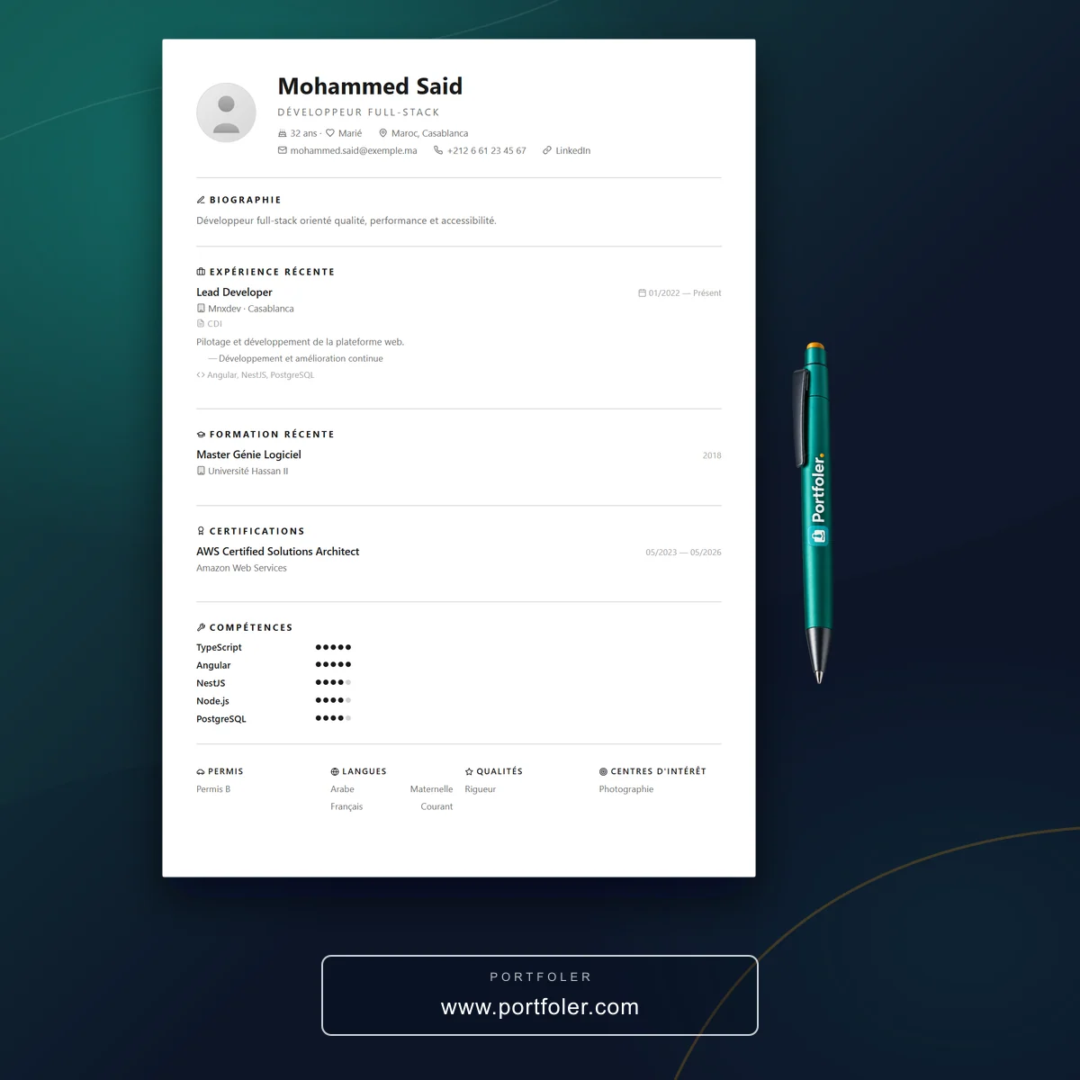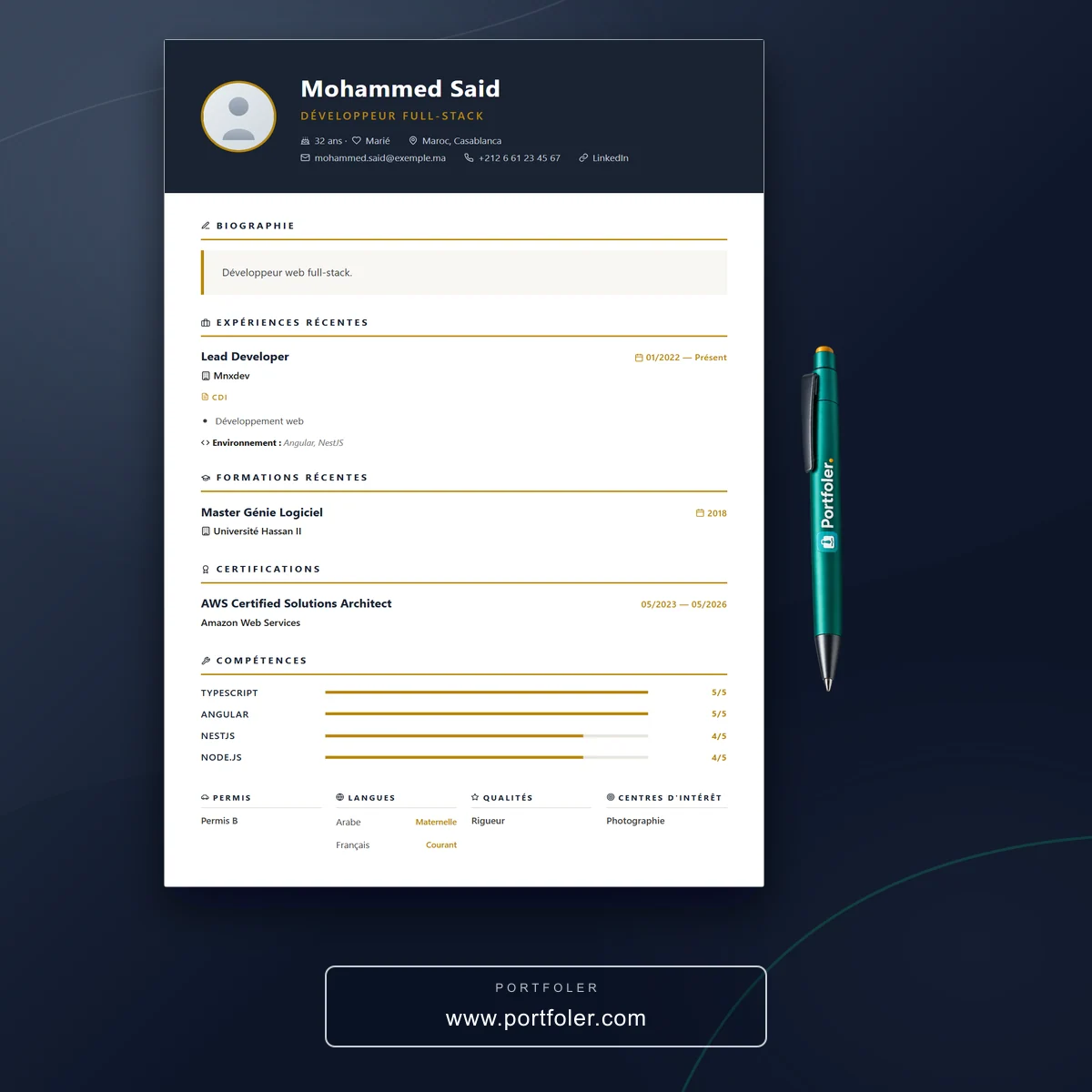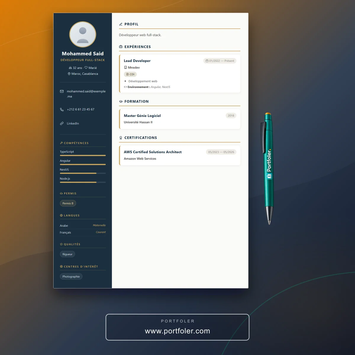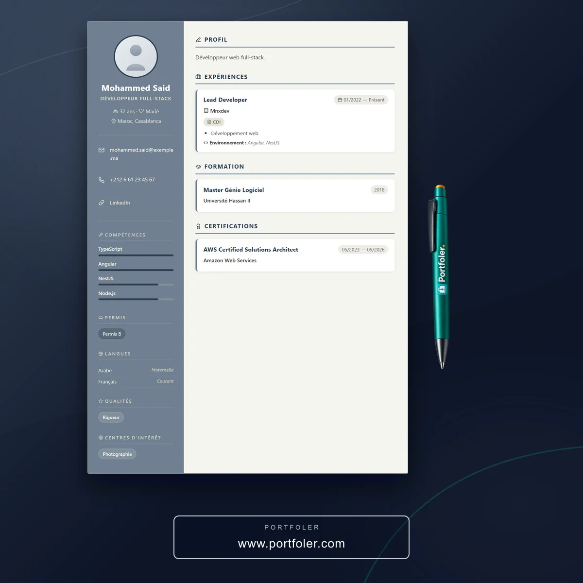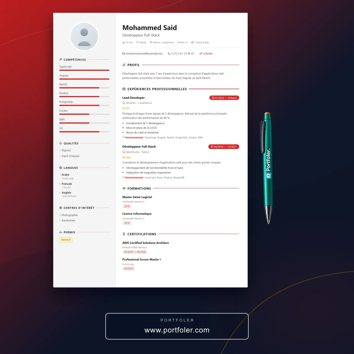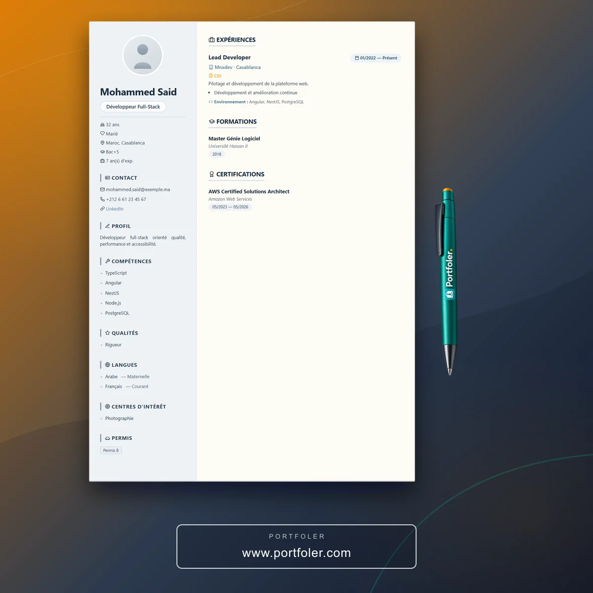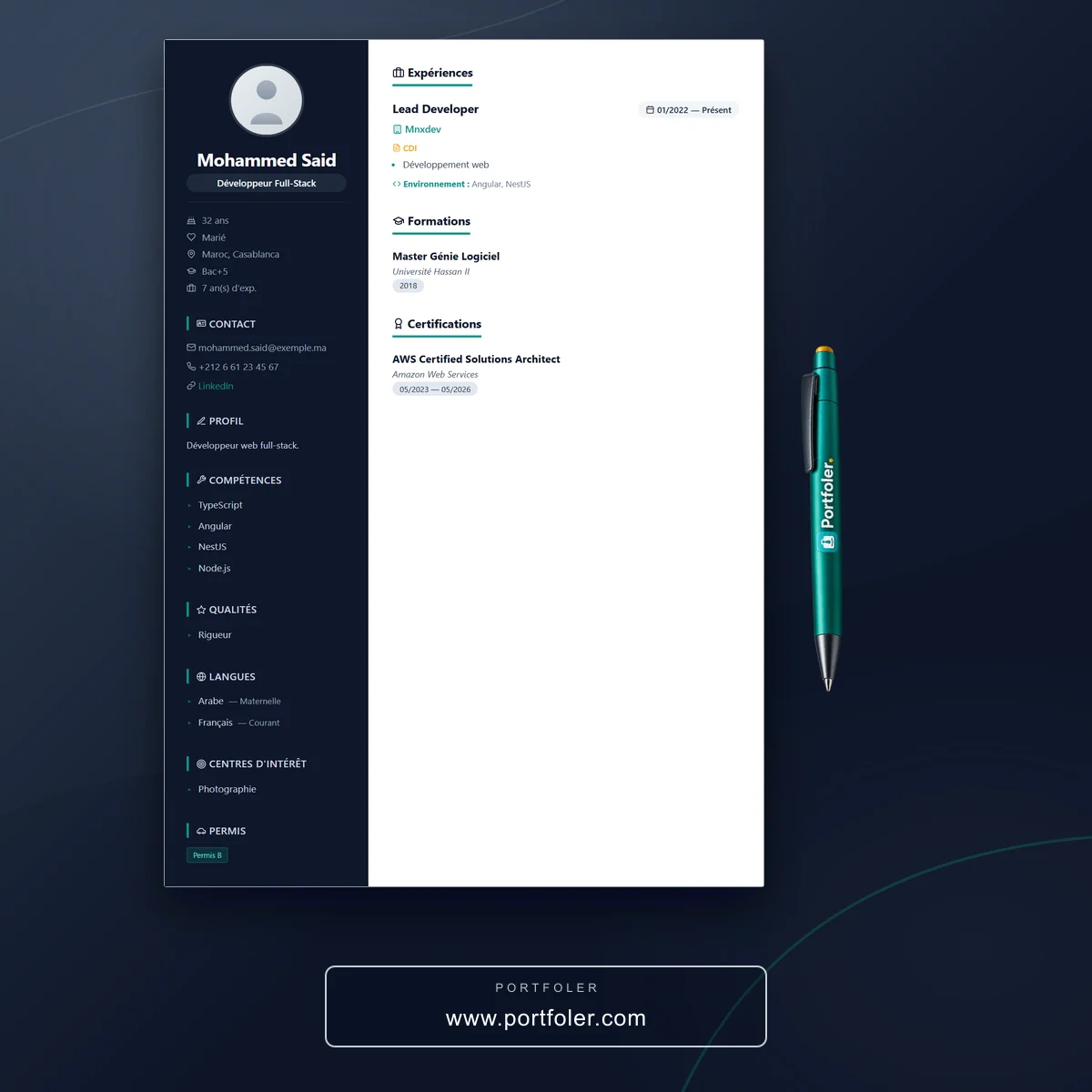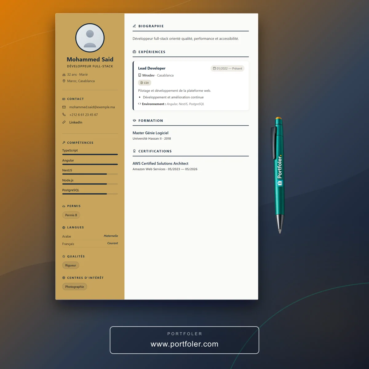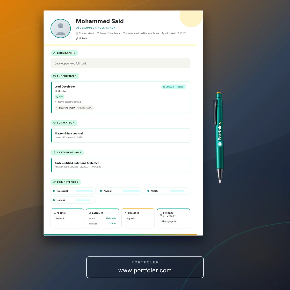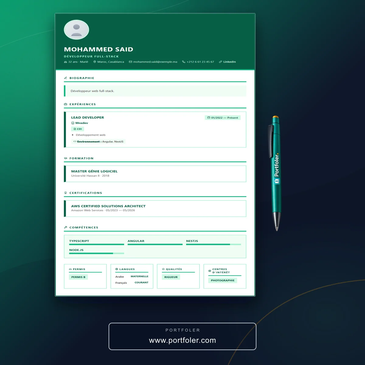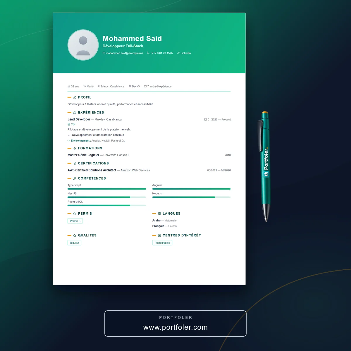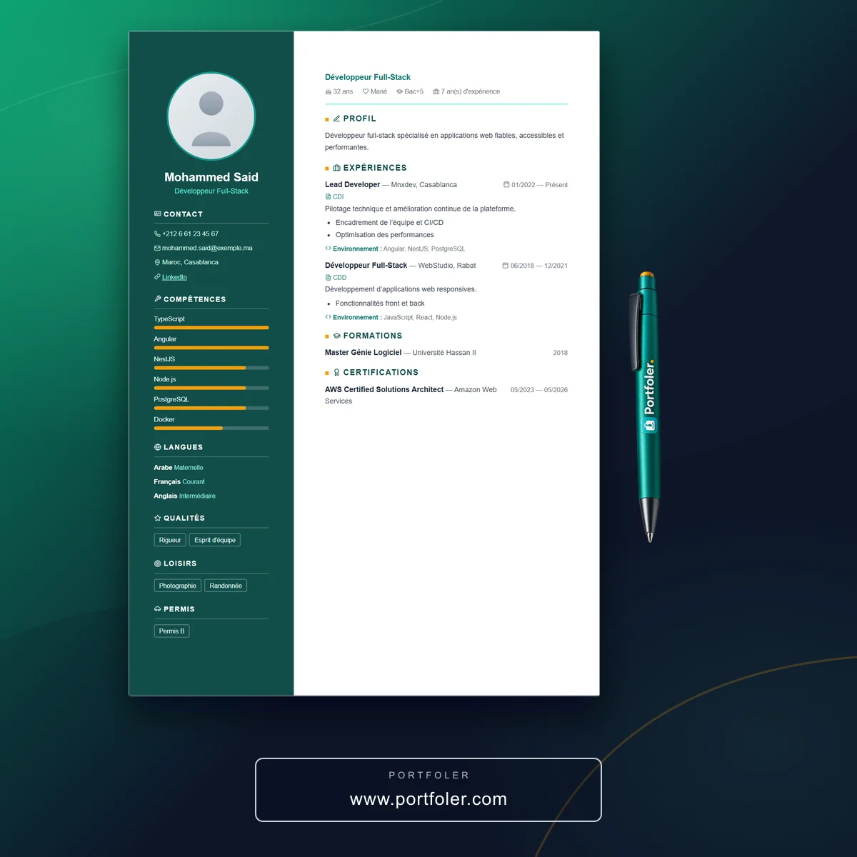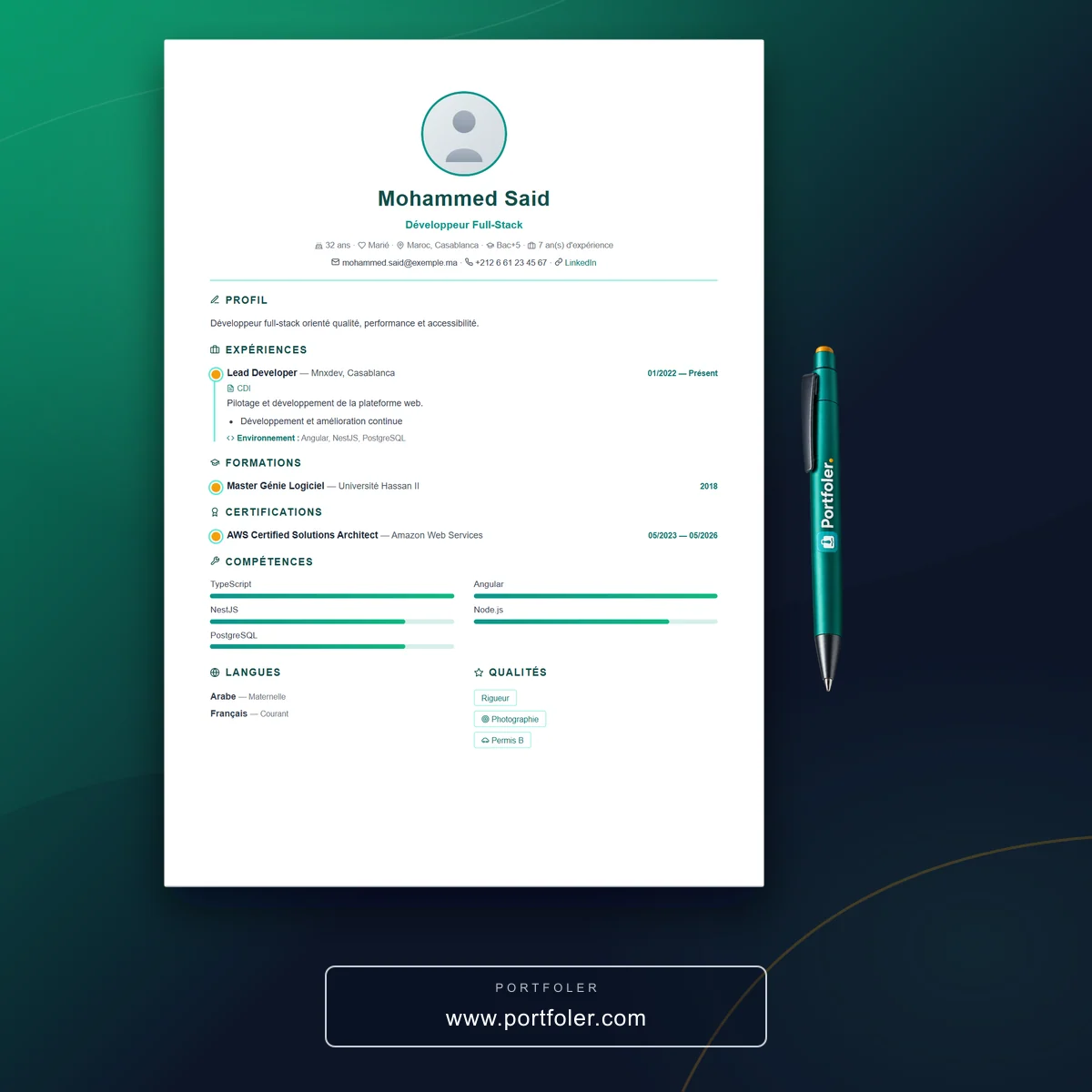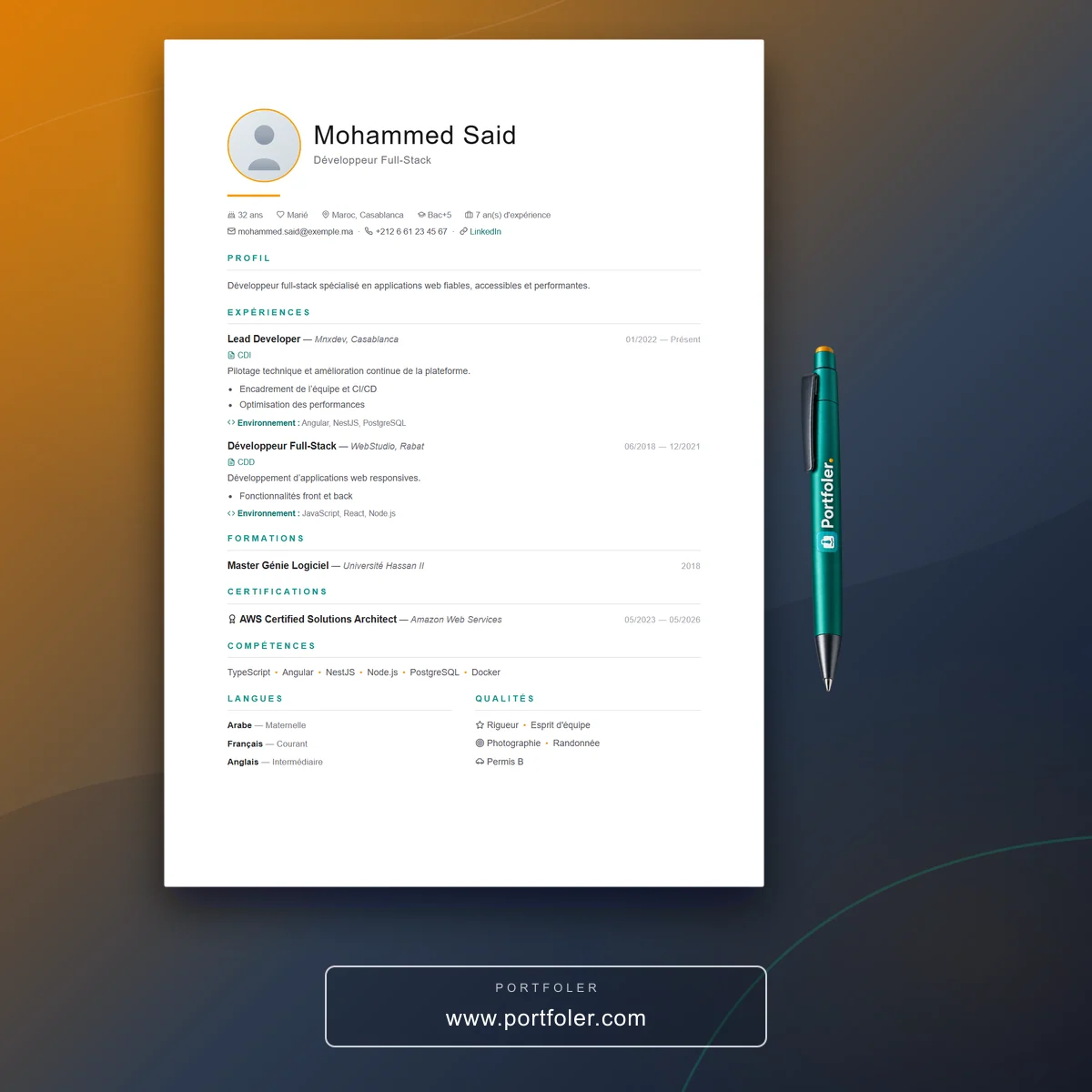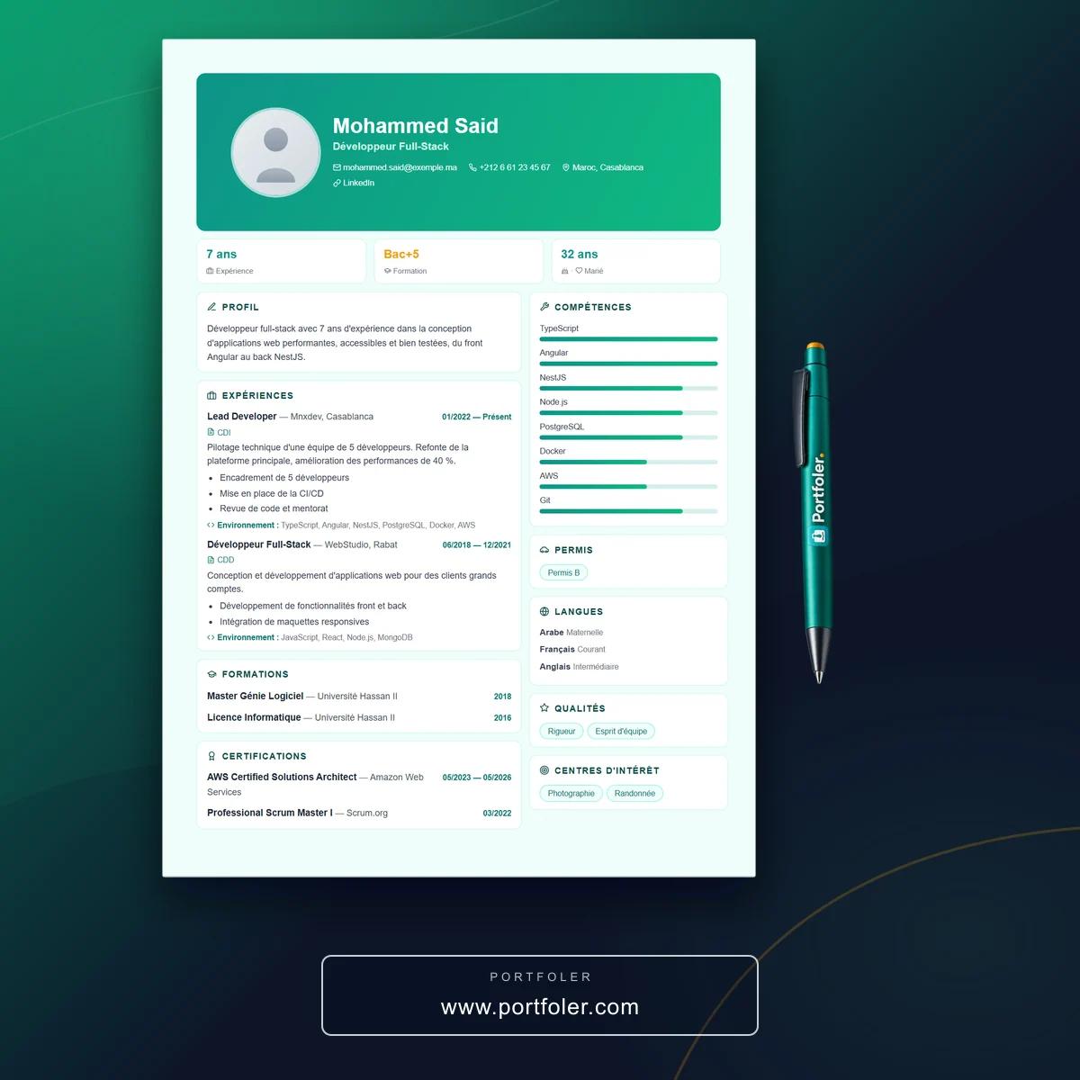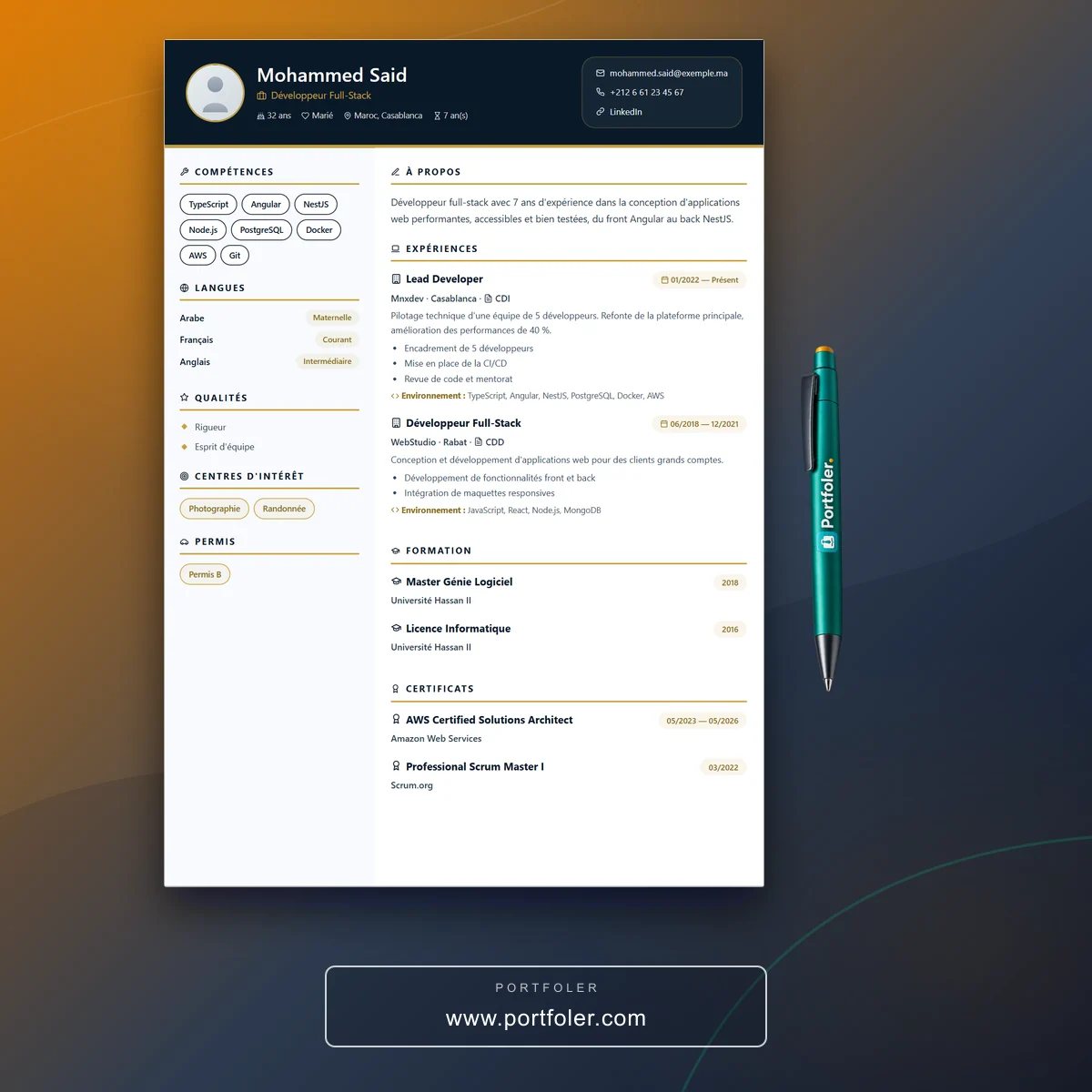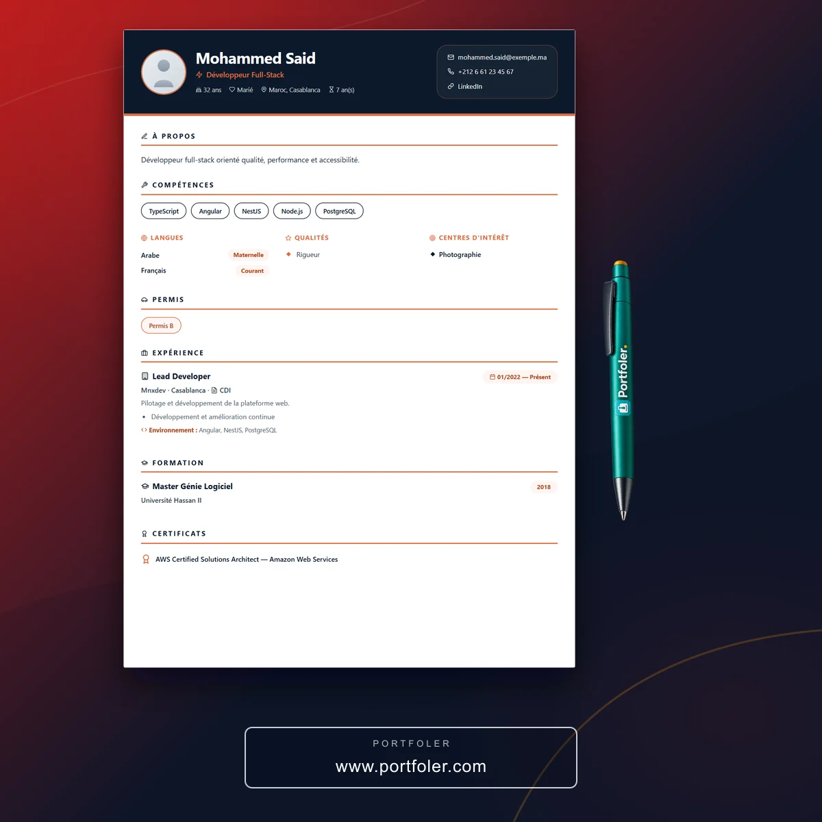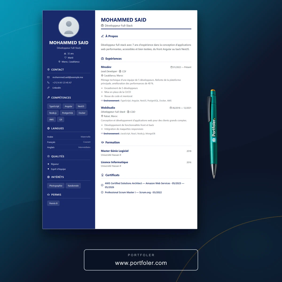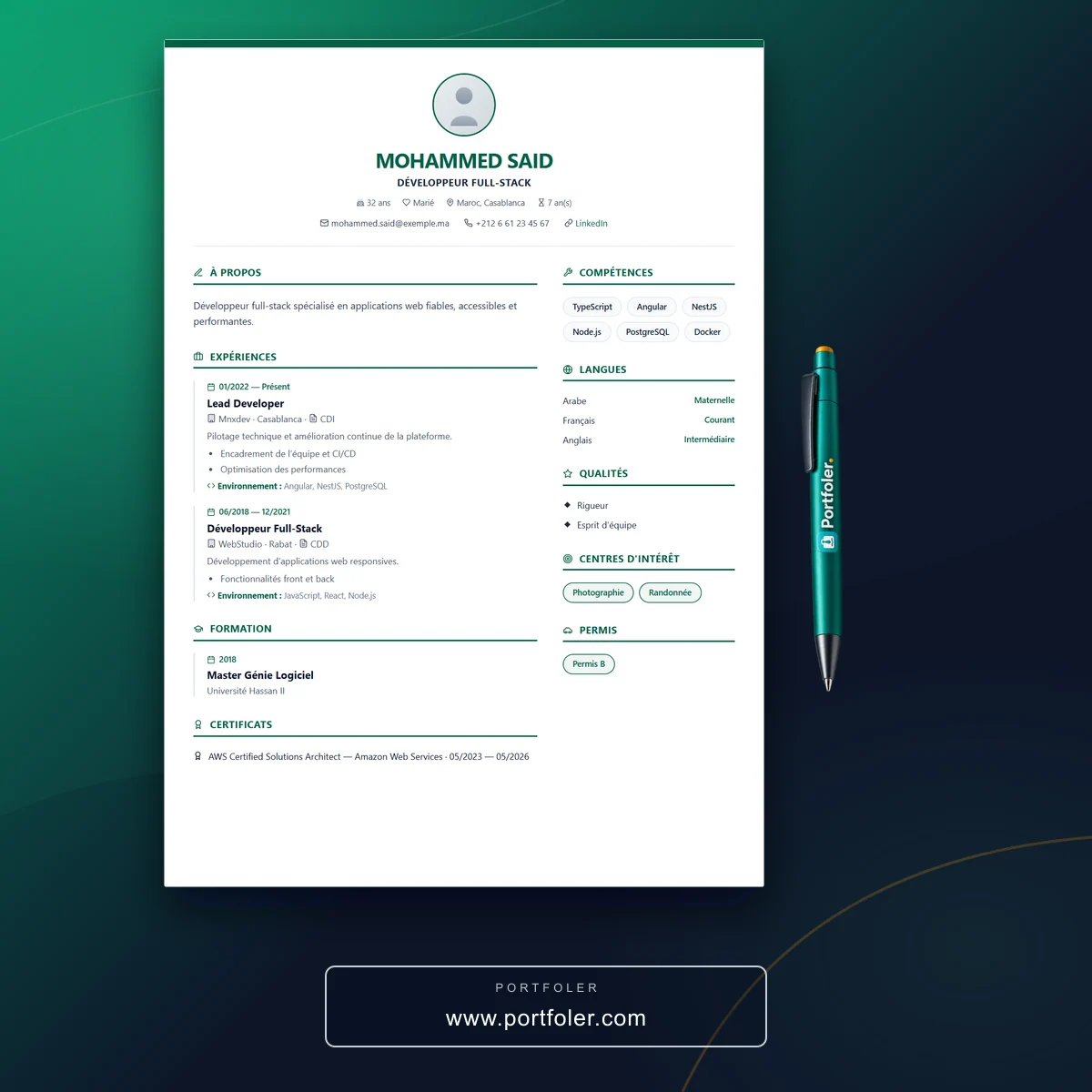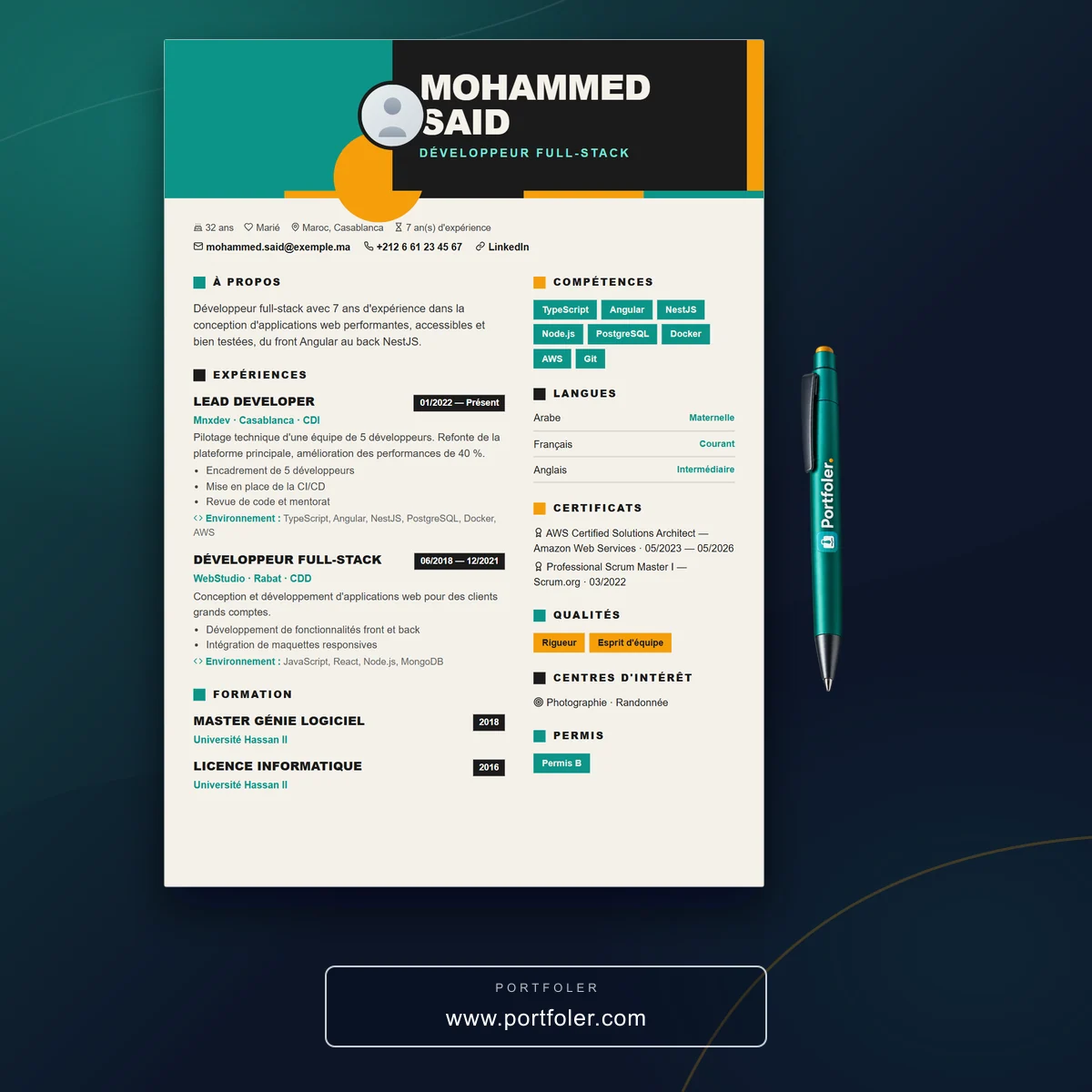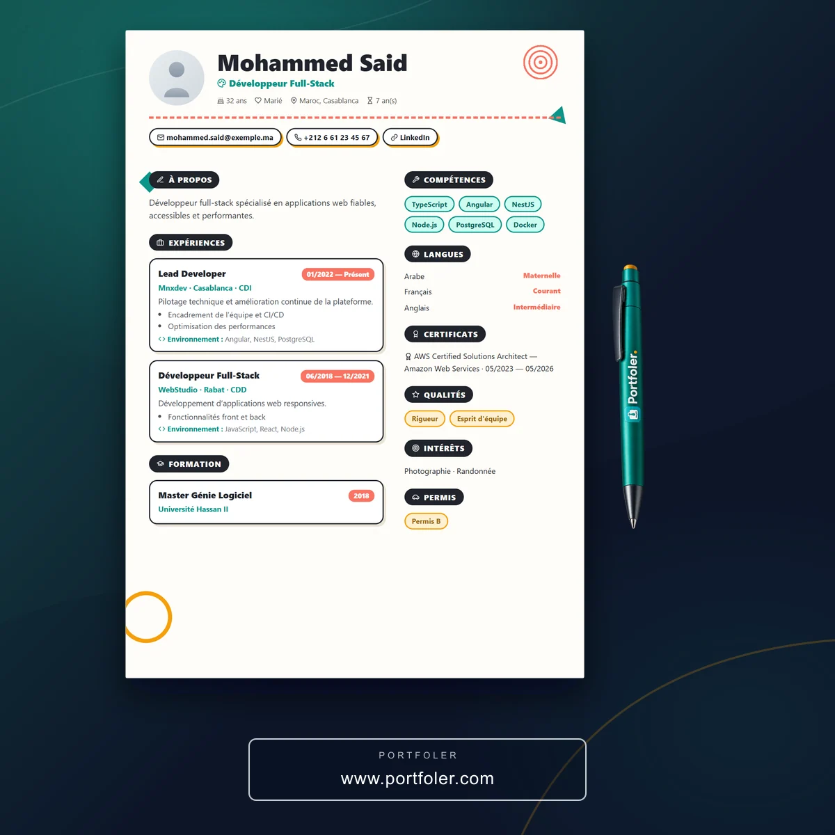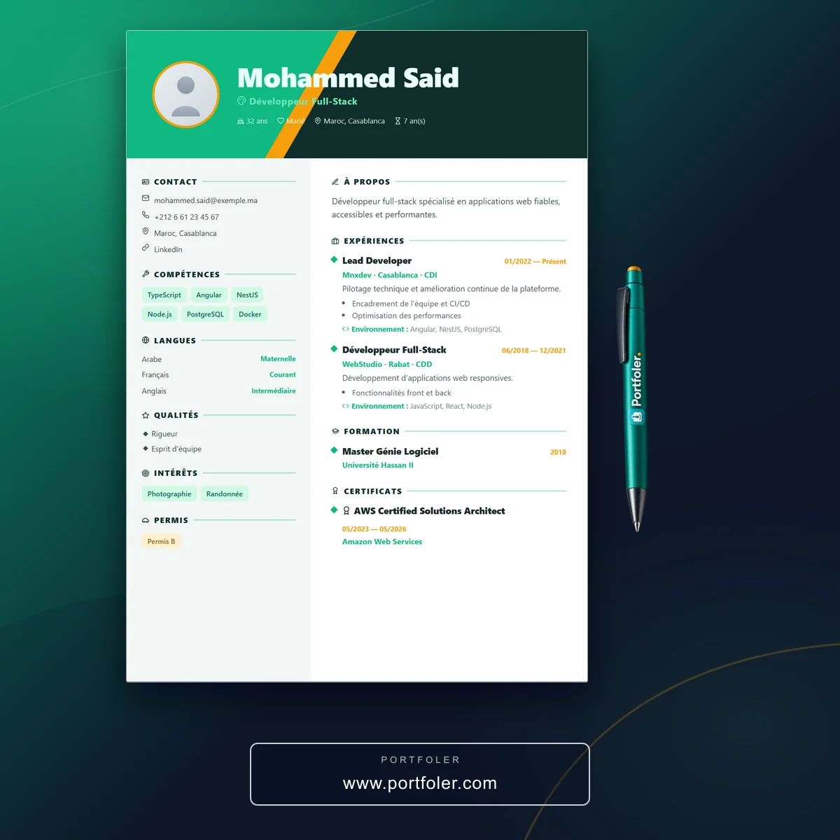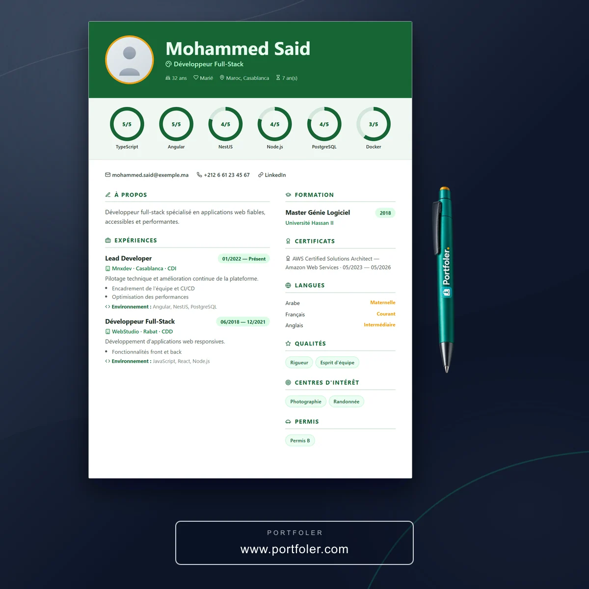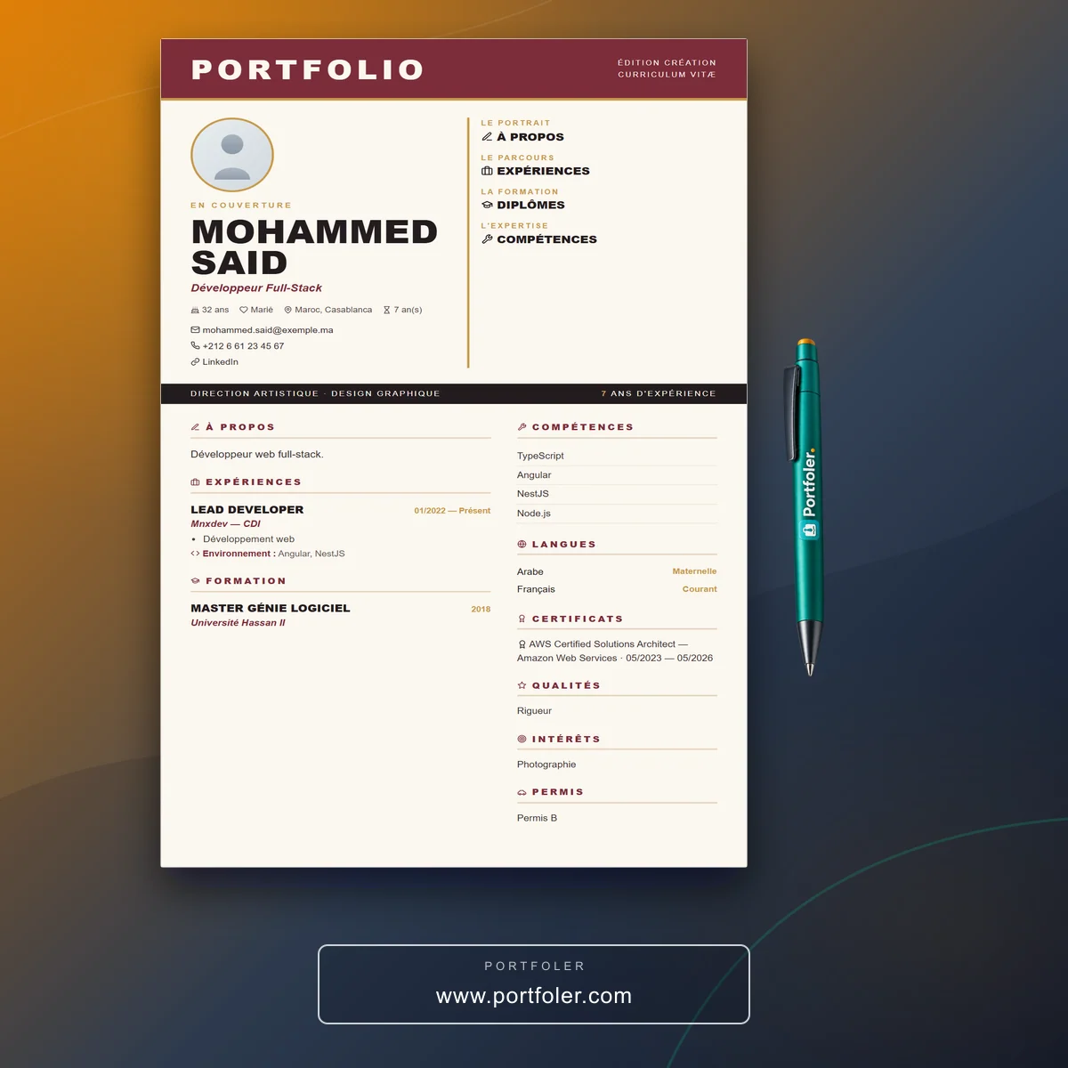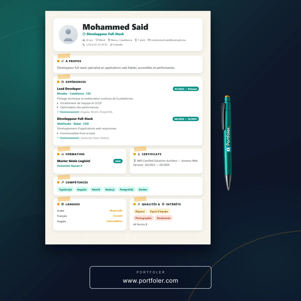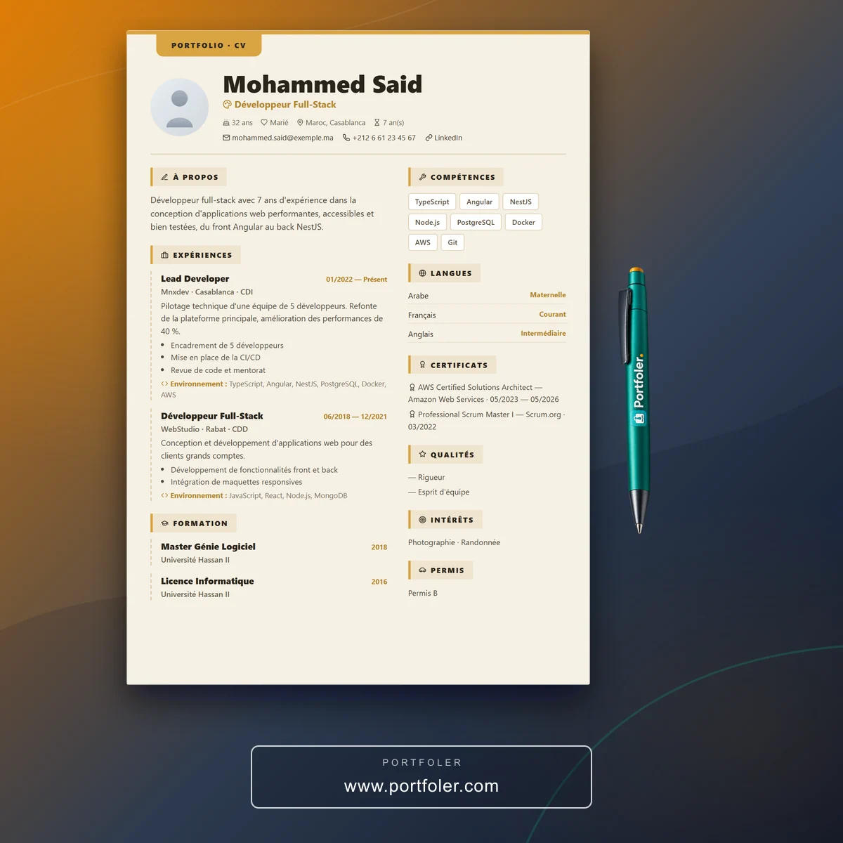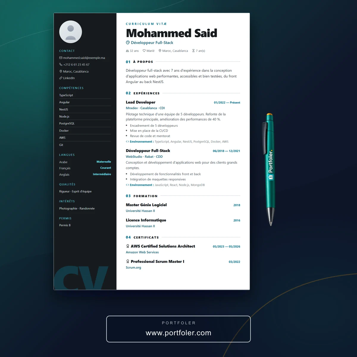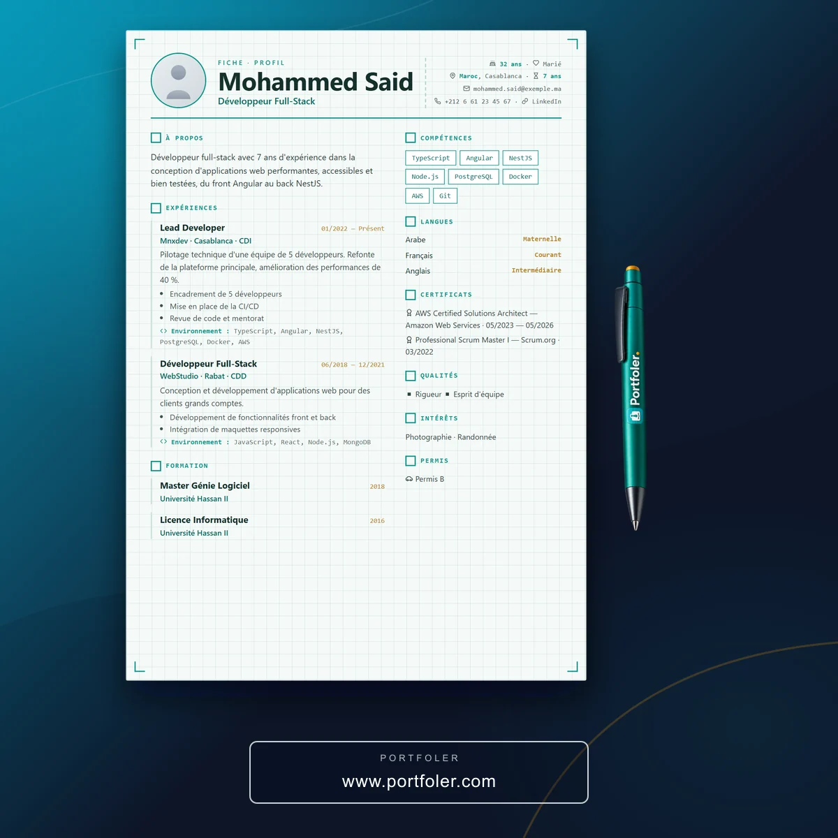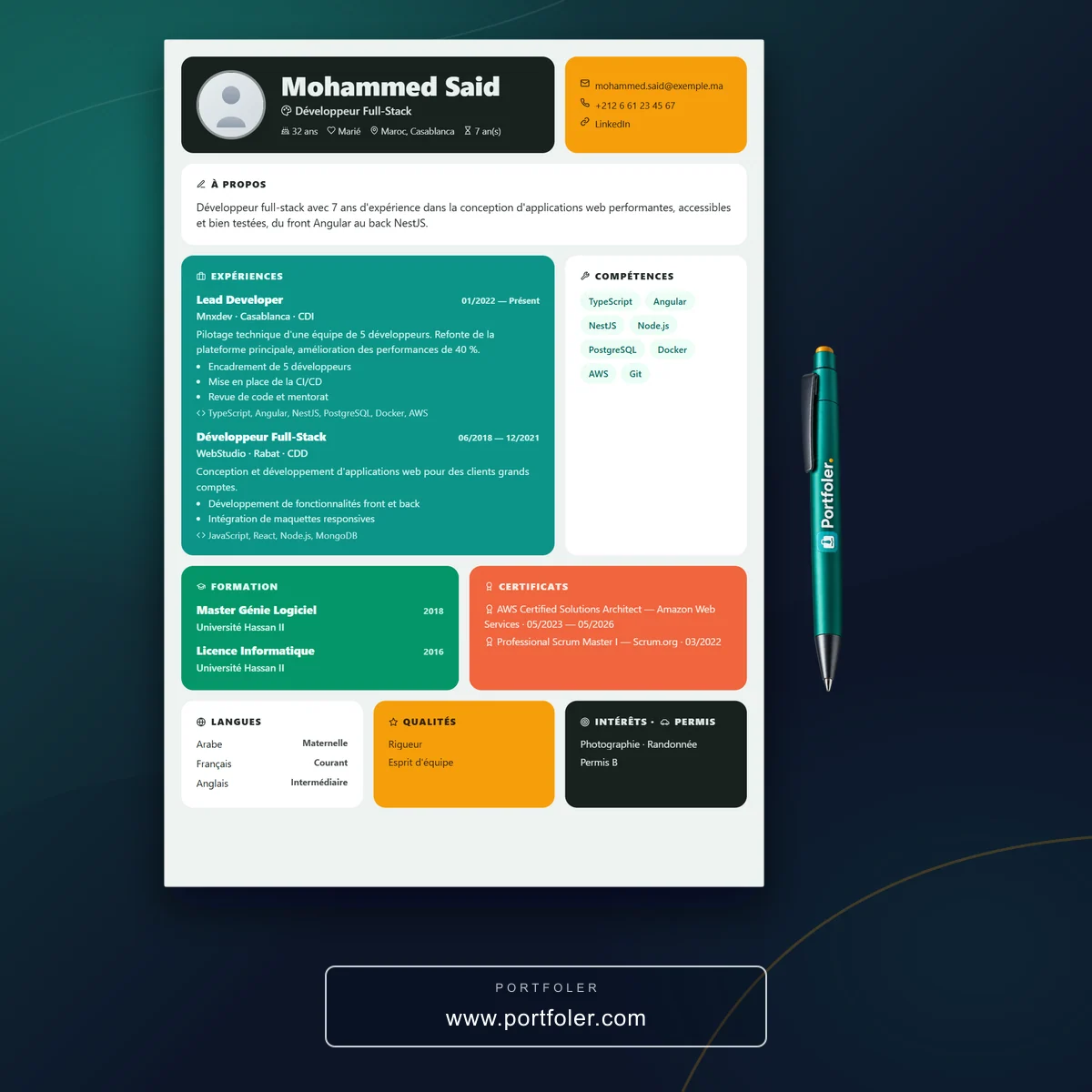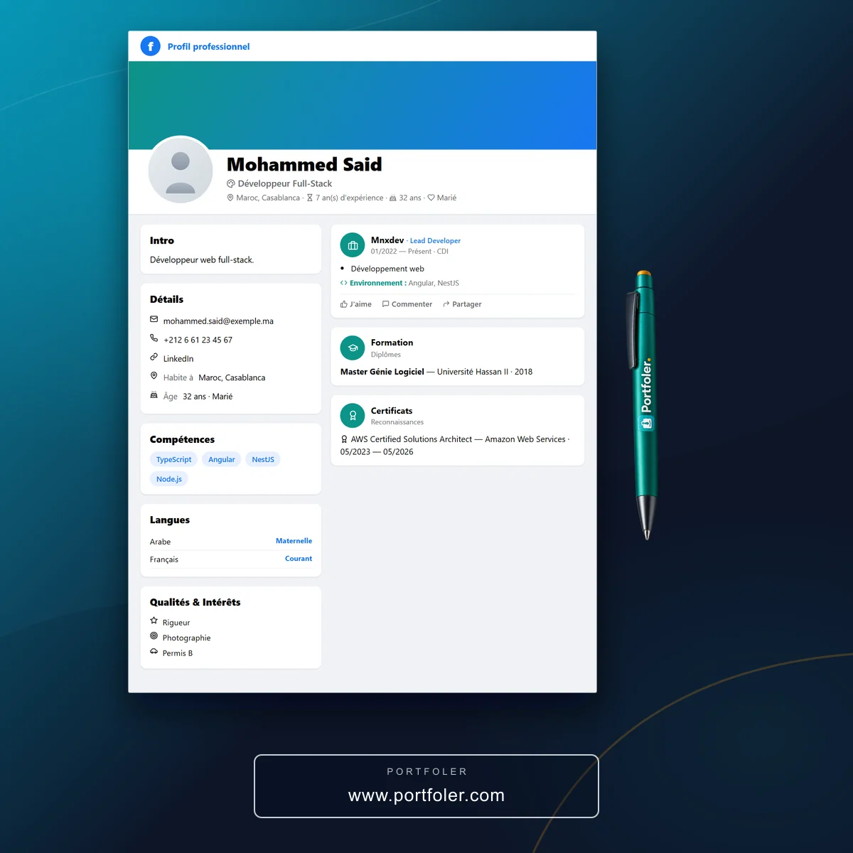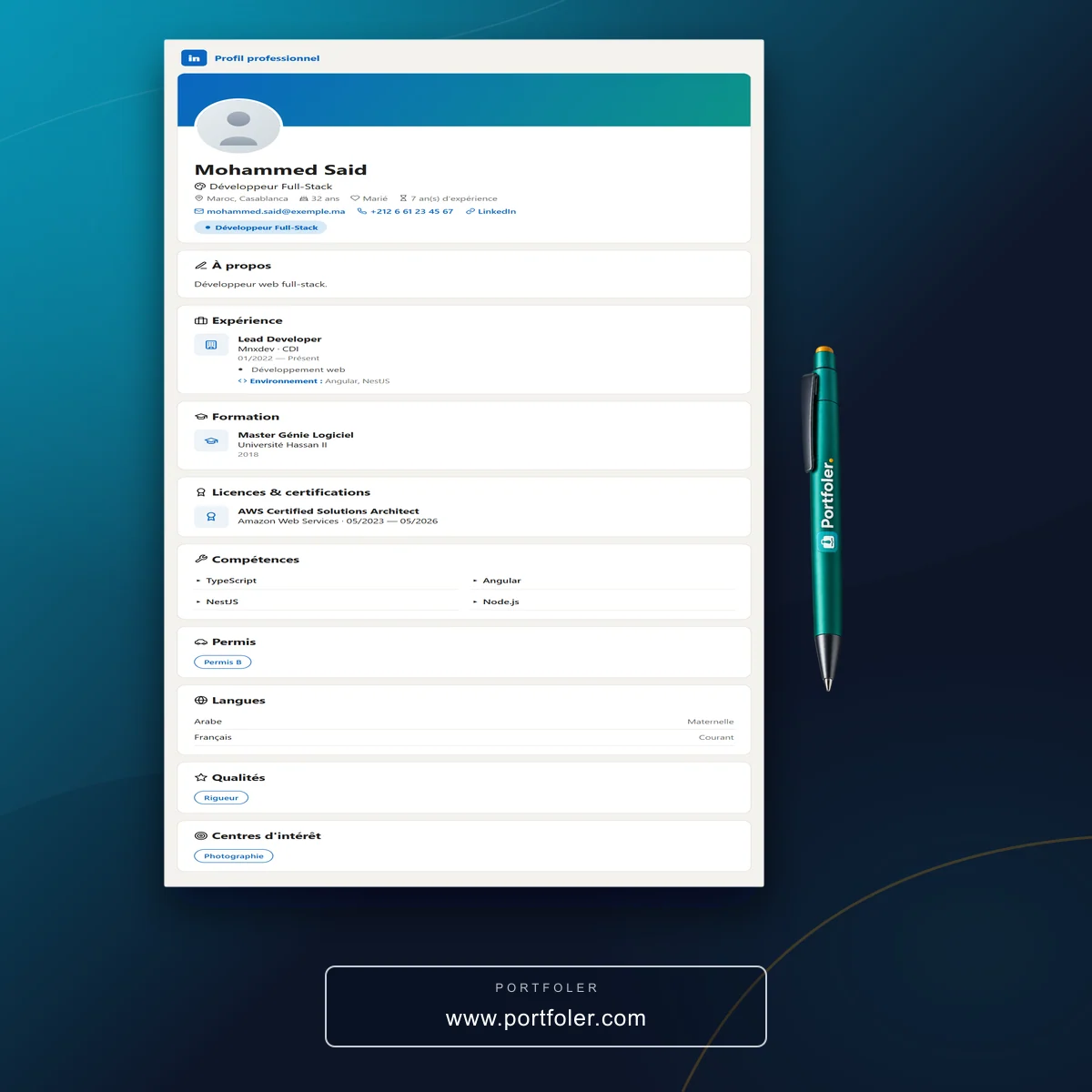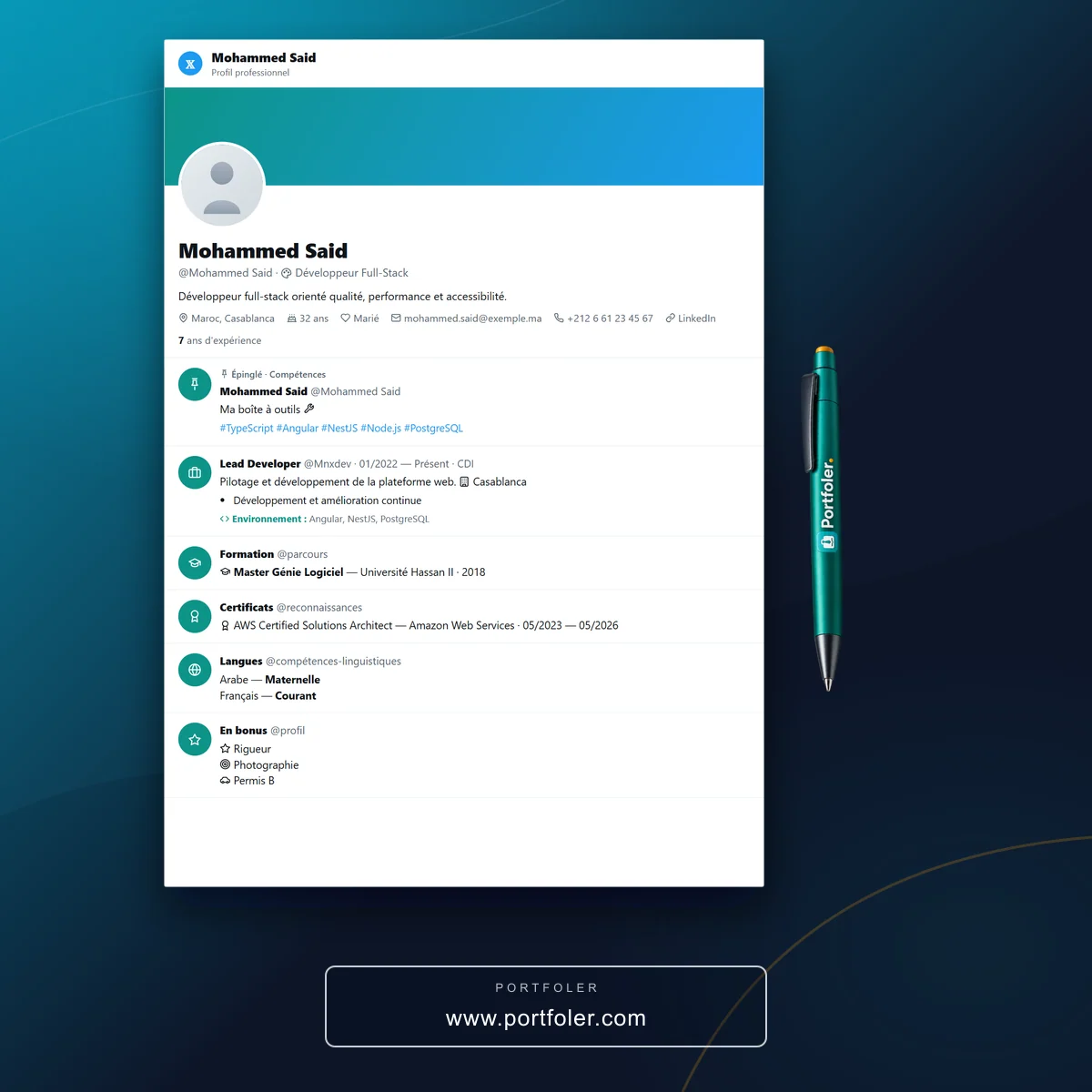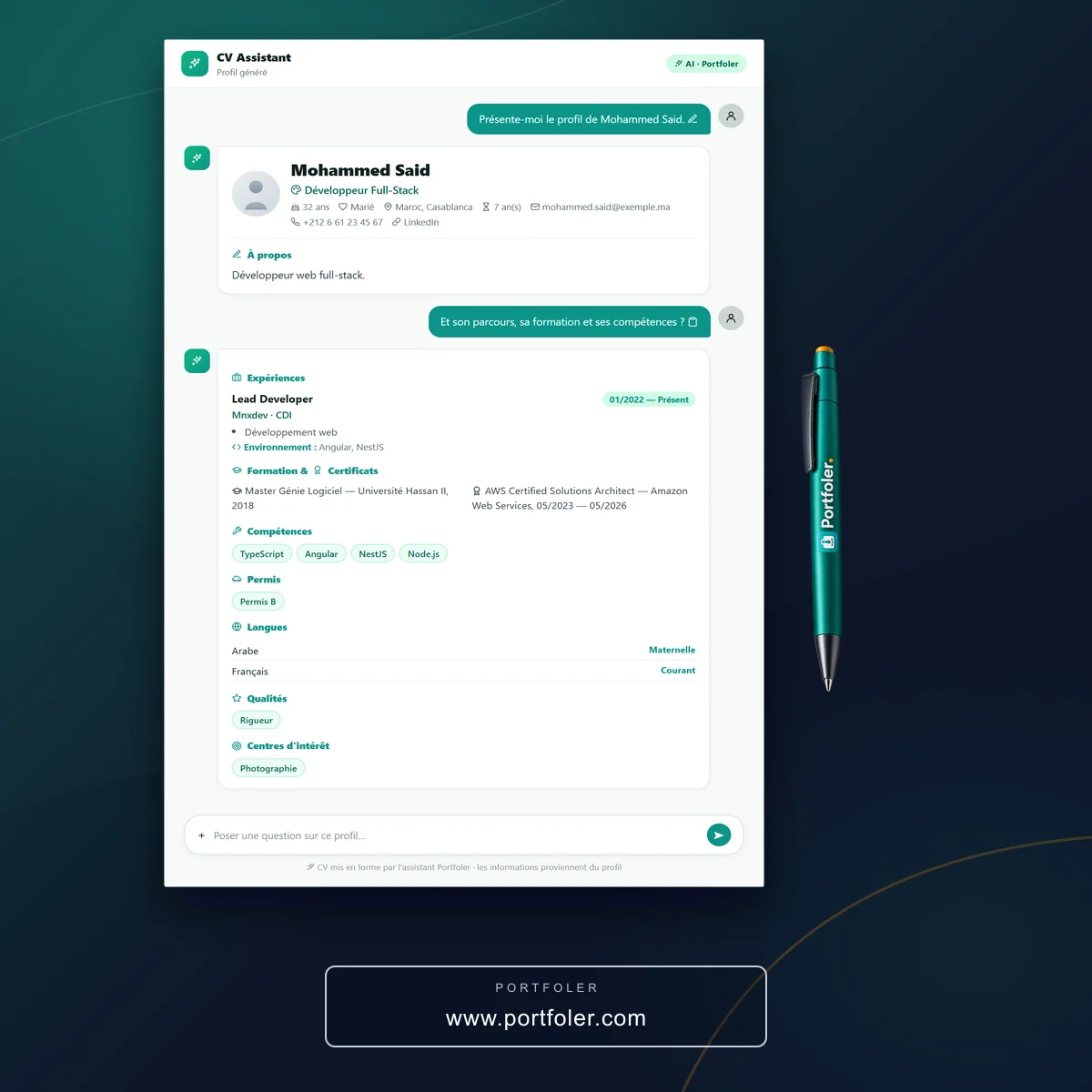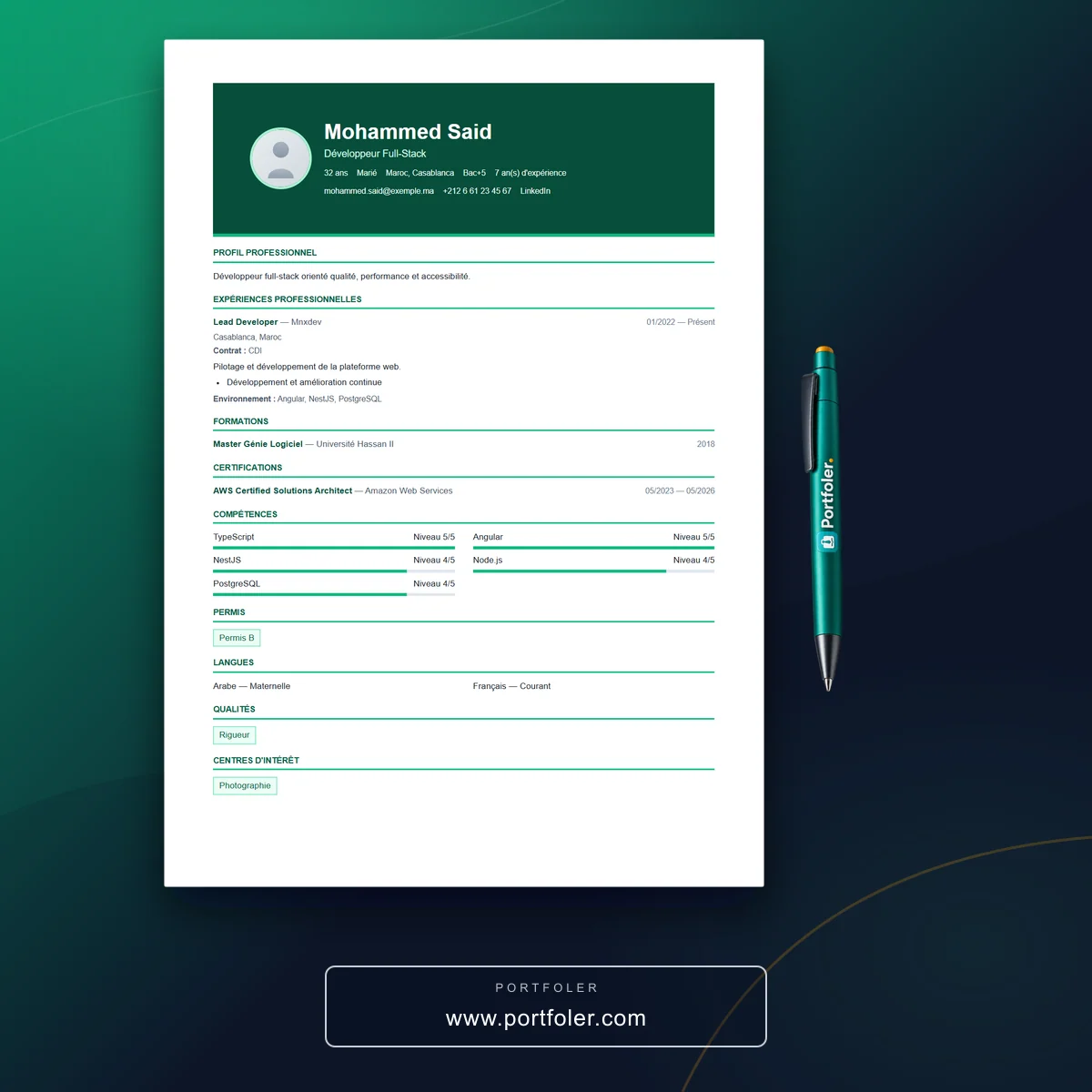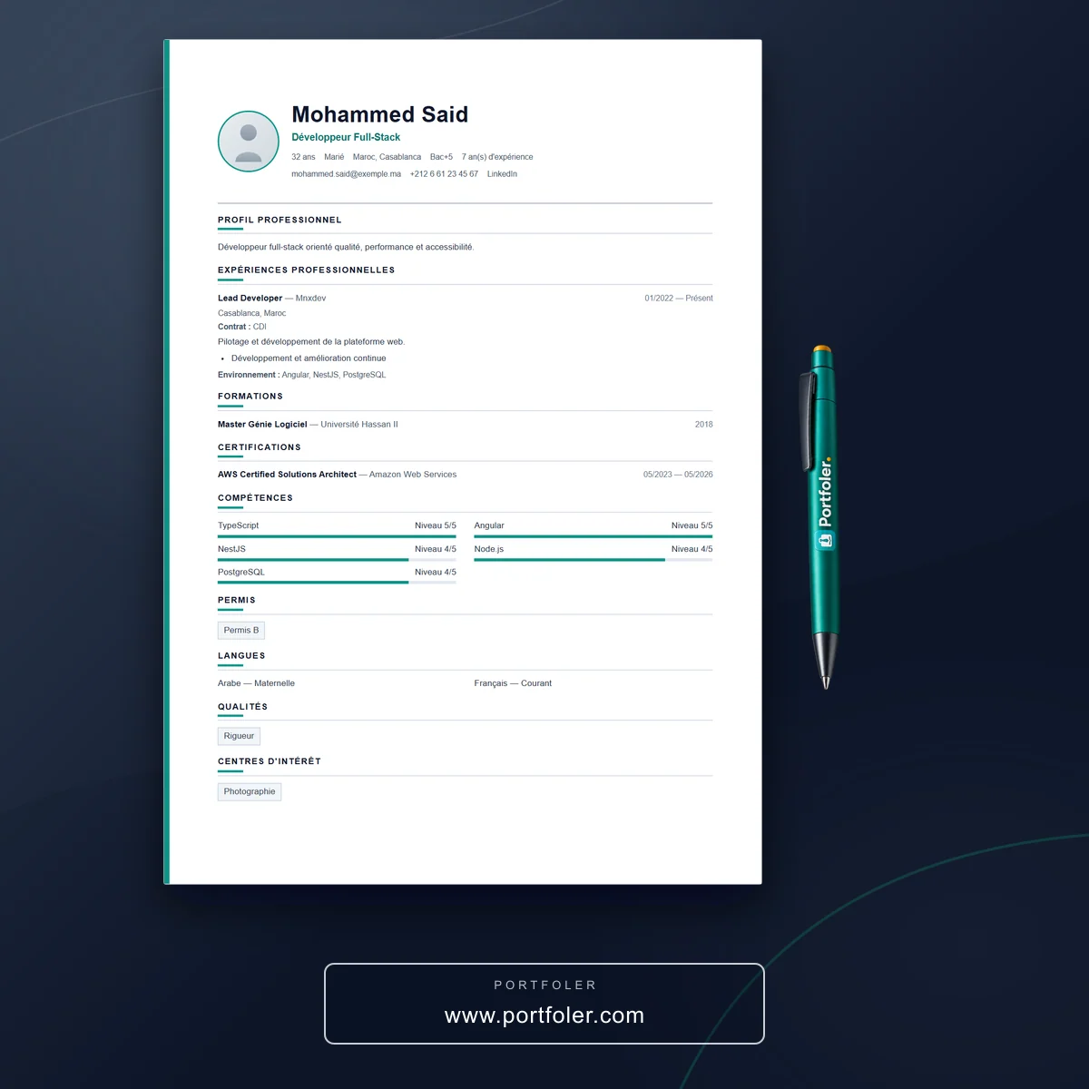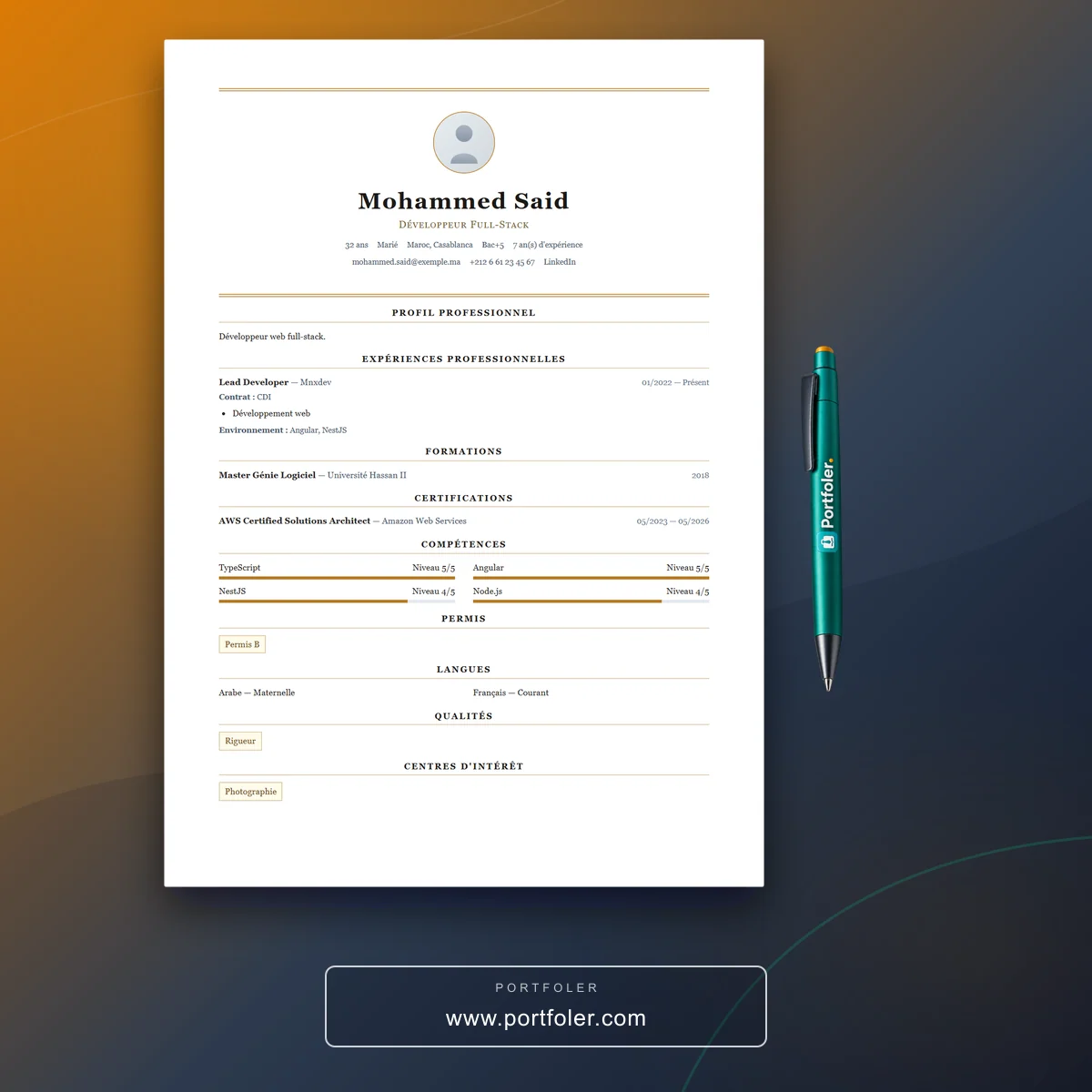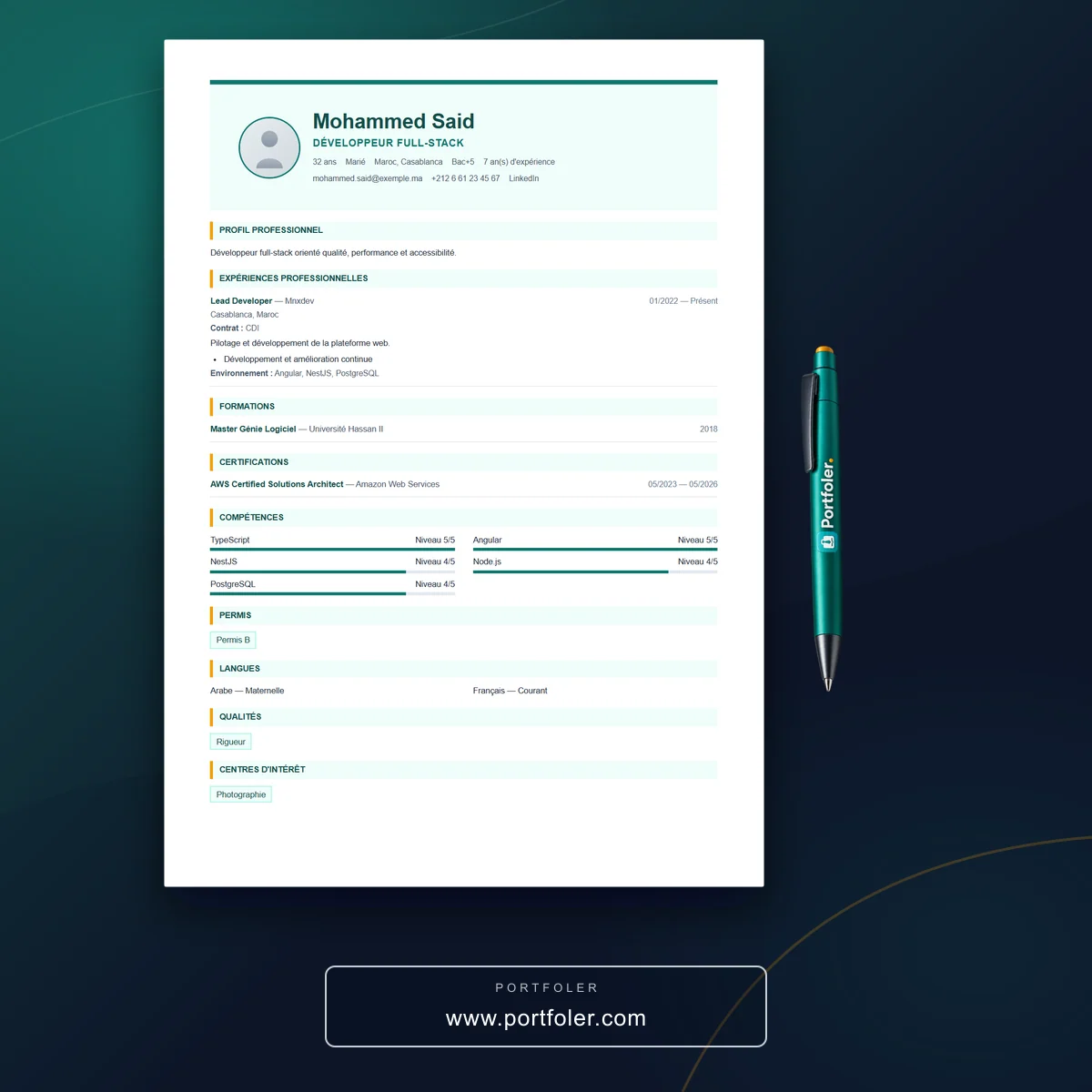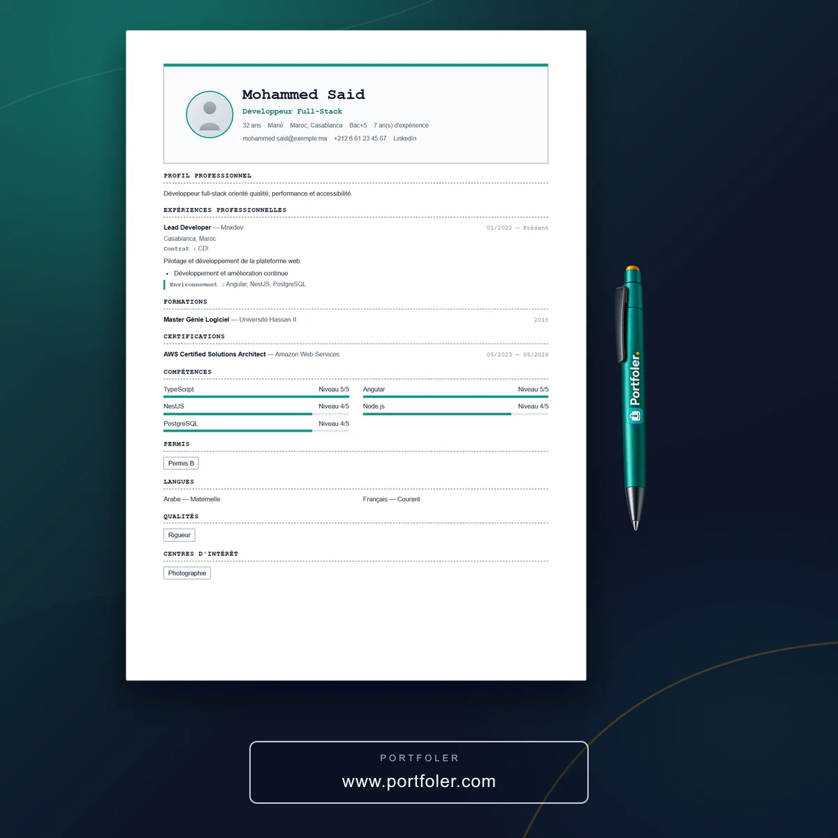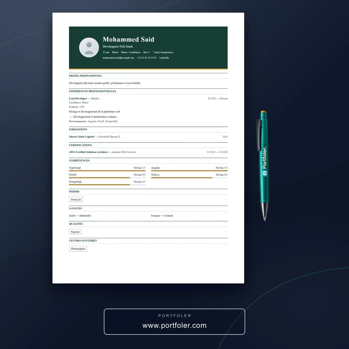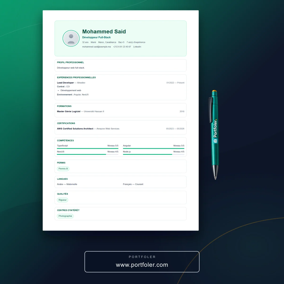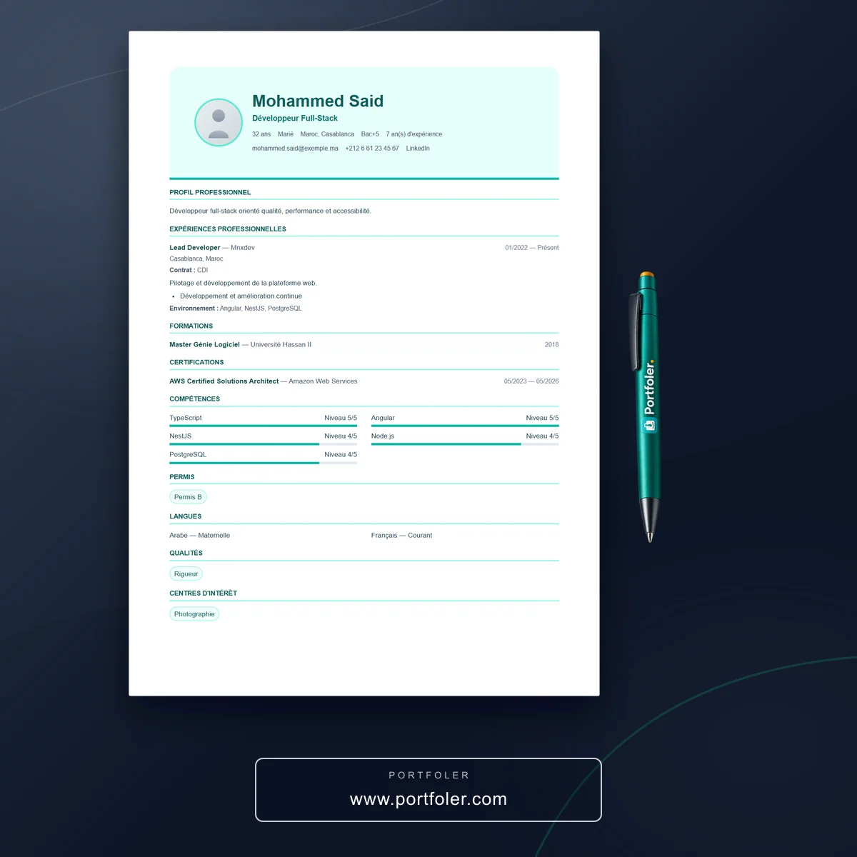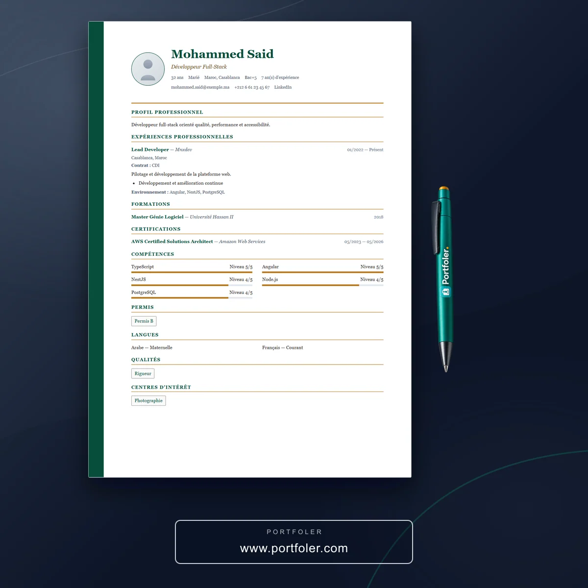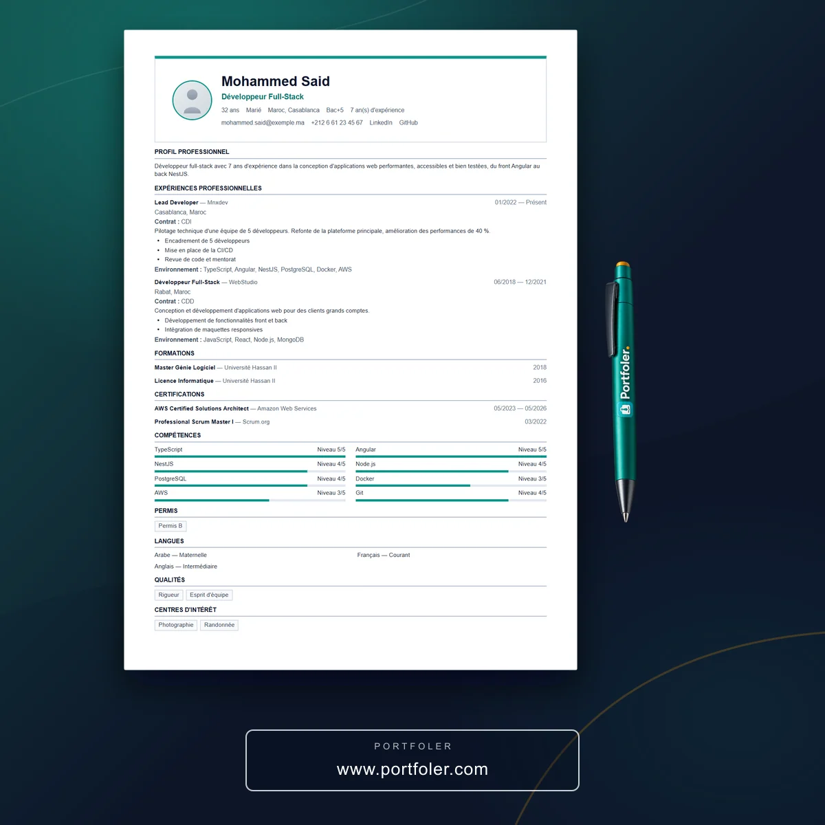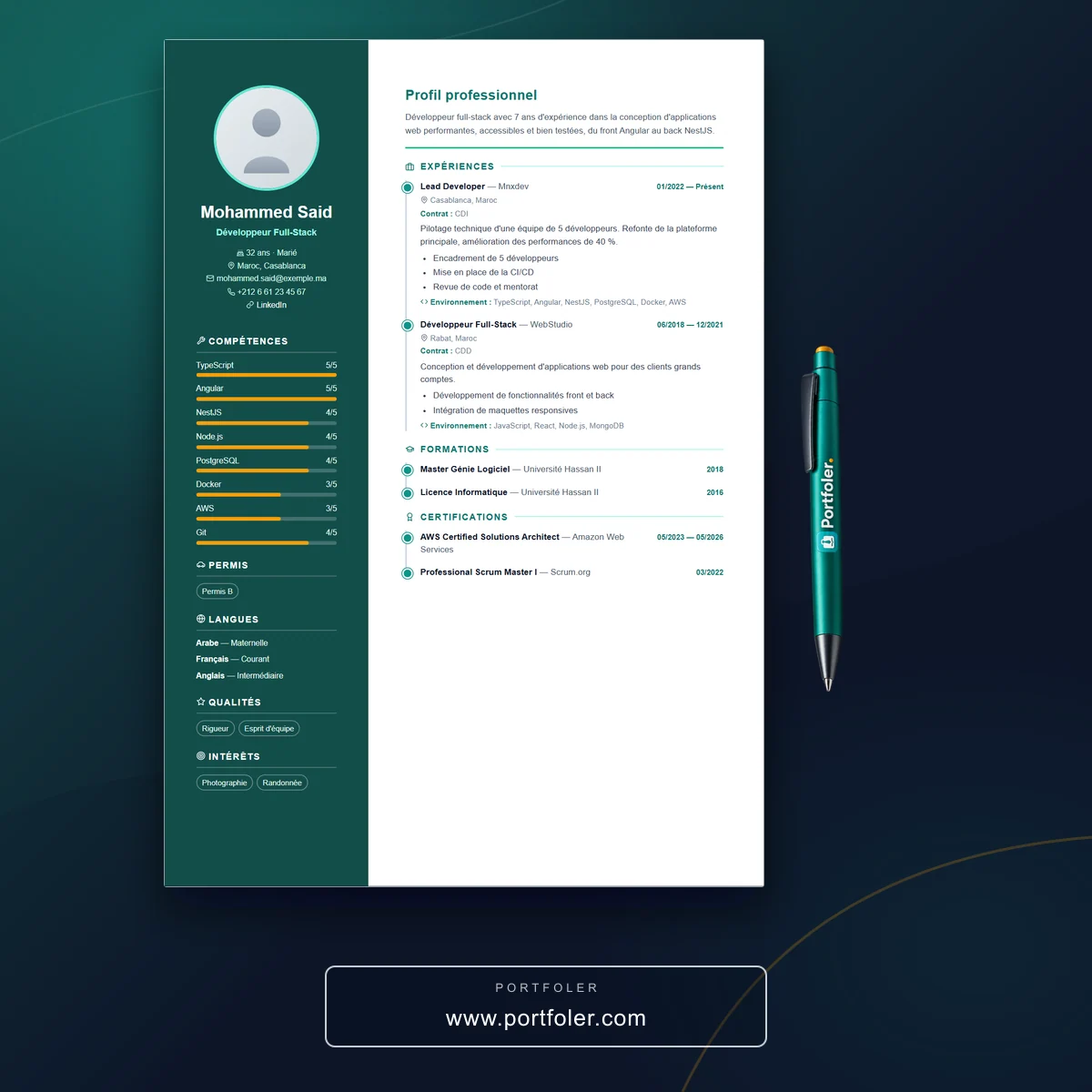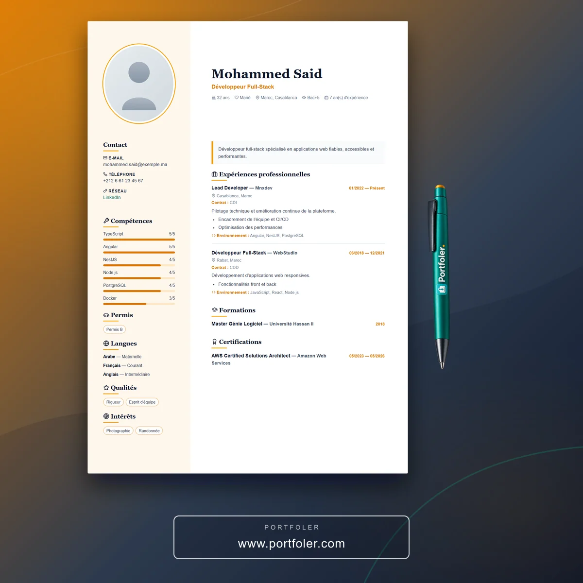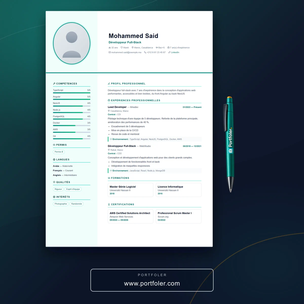
Your CV's content matters, but its form decides whether it gets read. A designer and a lawyer don't need the same template; nor do a beginner and a senior executive. Choosing the right template isn't about taste: it's about aligning your presentation with your job and the recruiter's expectations. Here's how not to get it wrong.
Start from your job, not your taste
The template should serve your profession, not flatter your eye.
- Creative fields (design, comms, arts): a template that embraces color and layout.
- Formal fields (law, finance, administration): a sober, structured template with no frills.
- Technical fields: room for skills and the technical environment.
Adapt to your experience level
What you highlight shifts with your background.
- Beginner: lead with education, projects and skills, in an airy template.
- Experienced: prioritize roles and quantified results.
- Career change: a template that showcases transferable skills before chronology.
Stay readable by software (ATS)
The prettiest CV is useless if a robot can't read it.
- Avoid exotic columns and text embedded in images.
- Prefer standard section titles and a simple structure.
- An "elegant but sober" template clears filters better than an overloaded one.
Think about the final medium
A CV is read on screen and on paper.
- Check the PDF output: margins, page breaks, contrast.
- Make sure it stays legible in black and white when printed.
- For Arabic or any right-to-left language, pick a compatible template.
In short
The right CV template is the one that showcases your job and level while staying readable — by a human and by software. Sobriety almost always wins; originality is reserved for jobs that demand it.
On Portfoler.com, choose from dozens of CV templates built for conversion and ATS-friendly, try several on your own content, and export yours to PDF in minutes.